Articles Tagged with: delphian gallery

Charley Peters in conversation with Remi Rough

Charley Peters is a painter. I don’t see her paintings as simply abstract, they are more about the formalism of painting itself, but she also uses the surfaces she works on as conveyances for her internal structures. There is an abundance of mathematics within her paintings, from the simple yet perfect gradients she often uses to the detailed repetitive shapes that are painstakingly drawn and subsequently painted into tiny masked off sections. Peters plays with the idea of how people consume and view her artworks on handheld screens so much so that some of her paintings look almost like digital glitches when seen on a phone. Her use of colour is bold and beautiful so it’s no wonder so many people have gravitated toward her work.In the ever changing landscape of the modern art world Charley Peters is a much needed agent of change.

charley peters

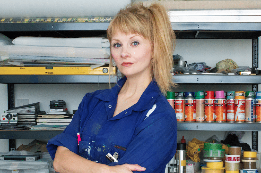
Charley Peters in the studio


You often utilise a mixture of materials in your paintings, I wondered how you initially engage with materials, did you purposely select them or was there more of an accidental discovery? 

Could you also expand on your use of airbrush as I find this a really interesting medium?


I predominantly use acrylic paint, which I apply with a brush, and spray paint or acrylic paint run through an airbrush. The two ways of applying paint – by brush or by spraying – have very different sensibilities, and I like to offset one against the other. I like painting to be as engaged with the substance and appearance of paint as creating an ‘image’, so using paint in different ways enables me to generate a variety of surfaces within each work. When I paint with a brush it’s a slower and more controlled process, I use heavy body paint against tape, usually mixed to the consistency of soft butter and like it to be matt and opaque. Sprayed paint has a dewy quality, it’s very wet and more difficult to control, but I enjoy how tricky it is. It can be used to create solid, flat colour or if applied more sensitively, it’s possible to build up tones in translucent layers. I love how sprayed paint can suggest infinite pictorial depth, the way that light and colour are diffused by spraying is beautiful and almost otherworldly. Running acrylic paint through an airbrush allows me to create the effect of spray paint but I have more control over colour (obviously spray paint colours are pre-mixed) and it’s a more deliberate way of applying sprayed paint; controlled and precise but still with the capacity to appear gestural and fluid.


Could you describe your ideal painting? Have you made it yet? (I often ask myself this question by the way).


No, I don’t think I’ll ever make my ideal painting. I have paintings that I’m more satisfied with than others, some that I like on a purely instinctive level and others that I can’t stand the sight of. What I’d like to achieve in my paintings is a perfect balance of colour, composition and form. I break down the picture plane into different spatial areas of divergent visual information – all treated as individual components, but through the making of the work I hope to bring them all together to create a sense of harmony, as if all elements were always meant to be together. I don’t like my work when it is overworked or overcomplicated, paintings can be technically difficult to make and labour intensive but I don’t think they need to look like that’s the case. I suppose I want to look at my paintings and for them to just ‘be’ right. Of course, right is a highly subjective term and I often deliberately break rules and do things wrong in order to make the painting right in the end. And paint is a very spirited and rebellious medium, it sometimes does wrong things all by itself, which is also exactly the right thing for it to do.


charley peters - delphian magazine

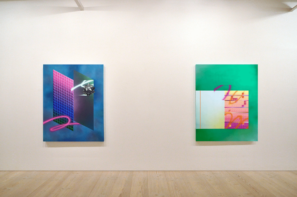
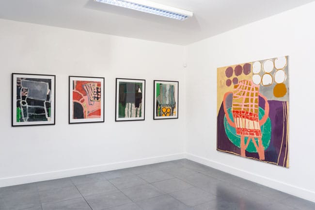
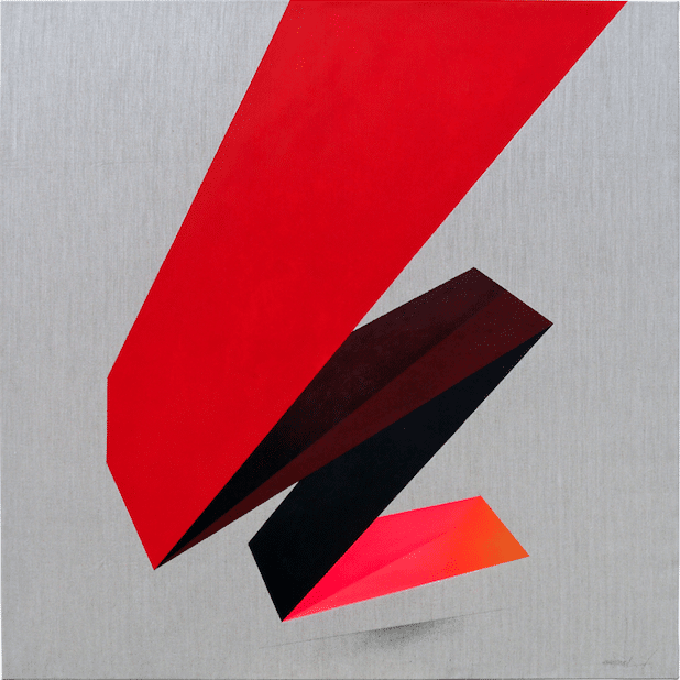
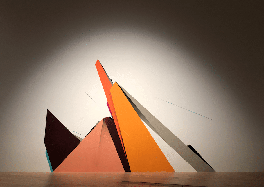
(L) ~NMH*NFM~ (2018), acrylic on canvas, 120cm x 150cm
(R) LM>Installed in Harder Edge: A Survey of Recent Abstraction, Saatchi Gallery, London (2018)

Having worked with you on numerous occasions, you seem to have a pretty loose approach to making your work yet they look so organised and pre-designed. Do you prefer to work to preset ideas or be more flexible?


I don’t organise or pre-design my work at all. Again, I think this relates to me trying to make the painting right or balanced from the starting point of a blank canvas. Making paintings for me is a very fluid process, there are some moments of logical thought and conscious decision making but mostly I rely on my intuition and impulsive actions. I never know what my paintings will look like once they are finished. I always start with applying colour to the painting’s surface, usually a flat, mid-tone colour that I’ve arrived at by not much thought at all…often just a sense of whether it might be hot or cold or bright or dark. After that I divide the surface up spatially and work on each area independently of the others. At this point I mask off large areas of the painting so can’t see much of what I’m doing. I’m working in the dark most of the time. I work in layers, similar to constructing images using Photoshop, I don’t consider the whole painting until it’s nearly finished. I usually paint on the floor and draw quick sketches as I paint as half-formed notions of what I might do next, but these are far from ‘working drawings’ and more like linear scribbles that barely make sense. Somehow they help me move through paintings until they can be considered finished. It’s a difficult way of working, like organising the chaos of not knowing where things are going – I end up changing my mind about things, adjusting colours or forms as I paint, I paint over things that have taken days of work – but it’s the best way for me. I like to go to the studio and leave my logical, overthinking mind elsewhere, I think I make better paintings that way.


Also, I wanted to respond to your introduction to my work in this interview, in which you describe ‘an abundance of mathematics’ within my paintings. I find ‘mathematics’ such an alien term. I find numbers impossible – I can’t read or remember them, even simple numerical systems like phone numbers and padlock codes confuse me and I get them wrong. I generally rely on visual maths in the studio, dividing spaces up by eye rather than measuring them. My rulers all have paint on them and I can’t easily read the numbers, if I count or add things up I have to do it several times and it is still wrong. It made me laugh when you used the word ‘mathematics’ as I’m not at all mathematical or precise when I work – I make a huge mess every time I do anything!


charley peters - delphian magazine

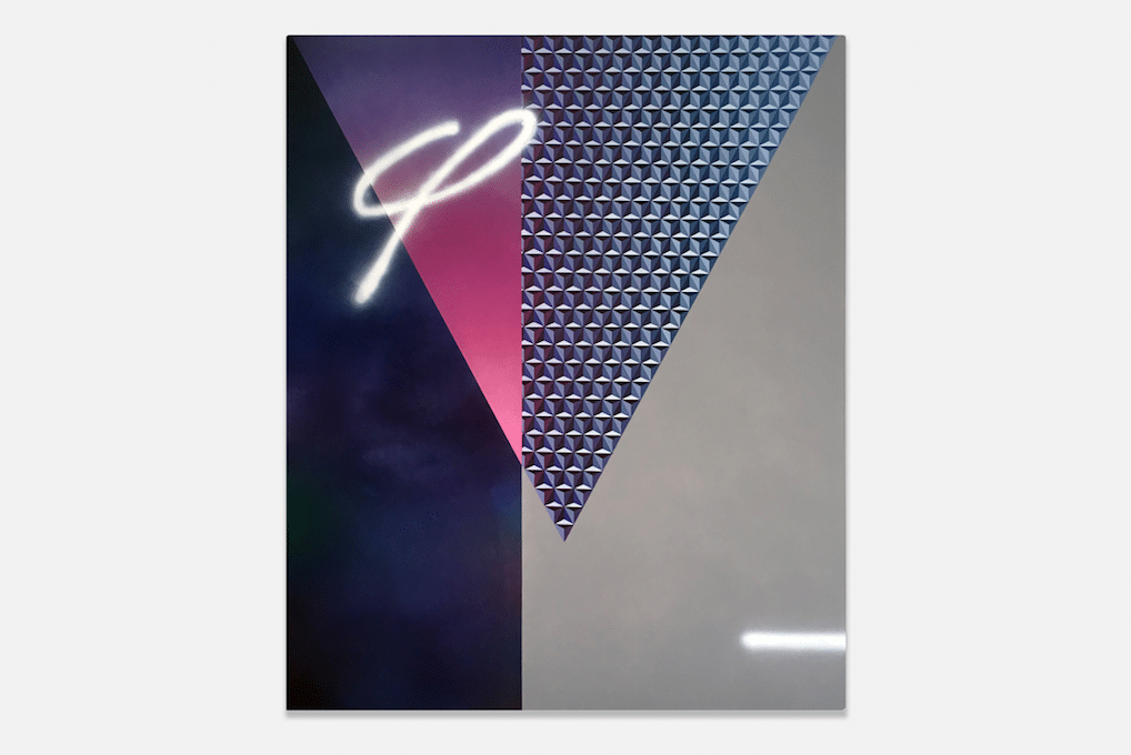
>THT< (2018), acrylic on canvas, 120cm x 150cm


There seems to be a renaissance of hard edge, more graphic work lately, is this a good thing or a bad thing? I often wonder if it hinders or helps myself?


It’s both good and bad. When there is an increased interest in a particular aesthetic or methodology it opens up more opportunities to show work and be part of an identifiable peer network of artists – this is mostly a good thing, it means we are relevant and interesting if only for a transient period of time. What can be bad about being ‘on trend’ is that people can stop being critical, they don’t see the good work from the bad, the innovative from the derivative. I’m uncomfortable with any sentimental or nostalgic positioning of particular genres of painting, and being associated with, for example, the hard edge or geometric abstraction, feels unthinking and too surface level a definition for what I think I should be making today. I’d prefer to think that I’m looking at the hard edge through the lens of contemporary visual media – and asking questions about the legacy of abstraction and what it is now. There is no point making work in a contemporary context that looks like it could have been made in the 1960s.


[Remi Rough] – I know you’re doing a writing residency later this year and wondered how important is that aspect of your work compared to painting?


[Charley Peters] – Painting is always more important, I’m a painter who writes. Writing about others’ work is a good way to articulate ideas within my own painting with an objectivity that is difficult when trying to be too self-reflective. I find writing a frustrating process, it’s far too logical and slow. More so than with painting I need some sort of plan or structure at the beginning and that pisses me off, it’s so boring. I make sense of the process of writing in a way that I can cope with. I write in layers, like I would make a painting, writing unrelated pieces of text that get expanded on or edited out in waves of activity until there’s a whole piece of writing with a beginning, middle and end. I see words as having a rhythm, colour or shape when put together in sentences and then they make sense to me as a resolved object. I think it’s as important to be critical when writing as it is to be critical when painting and I like my texts to have ideas and positions in them, even if I’m writing a review of an exhibition, I think there should be a more interesting subtext than merely discussing the show.


[RR] – Would you ever consider taking your work into a more sculptural plane?


[CP] – My paintings are ‘spatial’, they engage with the physical space of the canvas and the illusionary space that painting can create. I do think that they are as much objects as they are images or surfaces. I always consider that the edges of the paintings are part of the work, they are usually painted as an extension of the front of the canvas. I have also made several walk-in, or immersive, paintings – room-sized installations of wall and/or floor paintings – as well as smaller assemblages of disparate painted sculptural elements. Painting has the capacity to challenge our understanding of space and has a life that extends beyond being hung on a wall. Even the most benign rectangular canvas on a white gallery wall can manipulate and control space. I think it’s more important than ever to acknowledge painting’s sculptural potential in a world where most of what we experience is non-physical and seen on a screen.


charley peters - delphian magazine

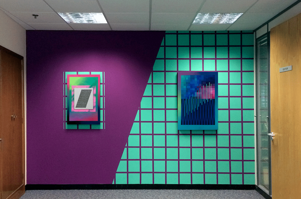
Editing Suite, Installed in The Future, Coventry Biennial of Contemporary Art, Coventry (2017)
Acrylic and spray paint on panel and wall painting


[RR] – Can you tell me about 3 artists dead or alive you have had a big influential impact on you and the way you work.


[CP] – Definitely Agnes Martin. Martin said that inspiration found her and that she could take no credit for it, she just emptied her head – especially of thoughts of herself – and inspiration would come into her ‘vacant mind’. This relates to what I was saying earlier about leaving my logical mind outside the studio. I think that painting became more interesting for me when I stopped planning, thinking and knowing what I was doing. Removing myself from the work as much as possible allows the paintings to make themselves – they feel more honest that way. I love Eva Hesse’s work, her bold and exploratory use of materials and textures is both intelligent and sensual. Sol LeWitt’s letter to Eva Hesse is something that I return to over and over again. It reminds me of the difficulties of making work and, again, the importance of ‘doing’ over thinking, worrying or second guessing. It’s a mistake to only credit him with that letter, he couldn’t have written it without her. And I’d also cite Carmen Herrera as being a significant figure for me. She exemplifies so well the strength and resilience of creative spirit, and makes shit hot paintings too.


[RR] – Do you think your artwork is a subjective window of your personality?


[CP] – That’s an interesting question…

Do you mean are my paintings a reflection of who I am, for example, an odd mixture of impulsiveness and discipline?! You should tell me – you know me well enough to say! I’m generally uncomfortable talking about my work in subjective terms. I have a formal painting practice, my concerns are with the relationships between colour, form and compositional space, and nothing emotional. I like how abstraction masks subjectivity so we can just see the work and nothing else. I’m certainly not positioning myself, my life experiences or opinions within my work and as such I’m resistant to any suggestion that my paintings are a representation, for want of a better word, of my personality. Of course, at times I may make subjective judgements on things like colour or when a painting is finished, but does that make ‘me’ part of the work? Sometimes if I’m tired or had a tough day does that affect the sensibility of my painting or the decisions I make in the studio? Maybe it does. You’ve asked a complicated question, and I can answer it by talking about my intentions for the work and how I like to consider my painting as a non-subjective entity. It’s possible that this isn’t entirely true though, it’s so difficult to say where decisions in the studio come from and how much of that is driven by intuition or experience.


Both artists are still exhibiting at the The House Of Saint Barnabus alongside Peter Lamb,  and Charley is showing at Fold Gallery until the 2nd of March.

If you enjoyed Remi interviewing Charley, read Charley interviewing Remi HERE

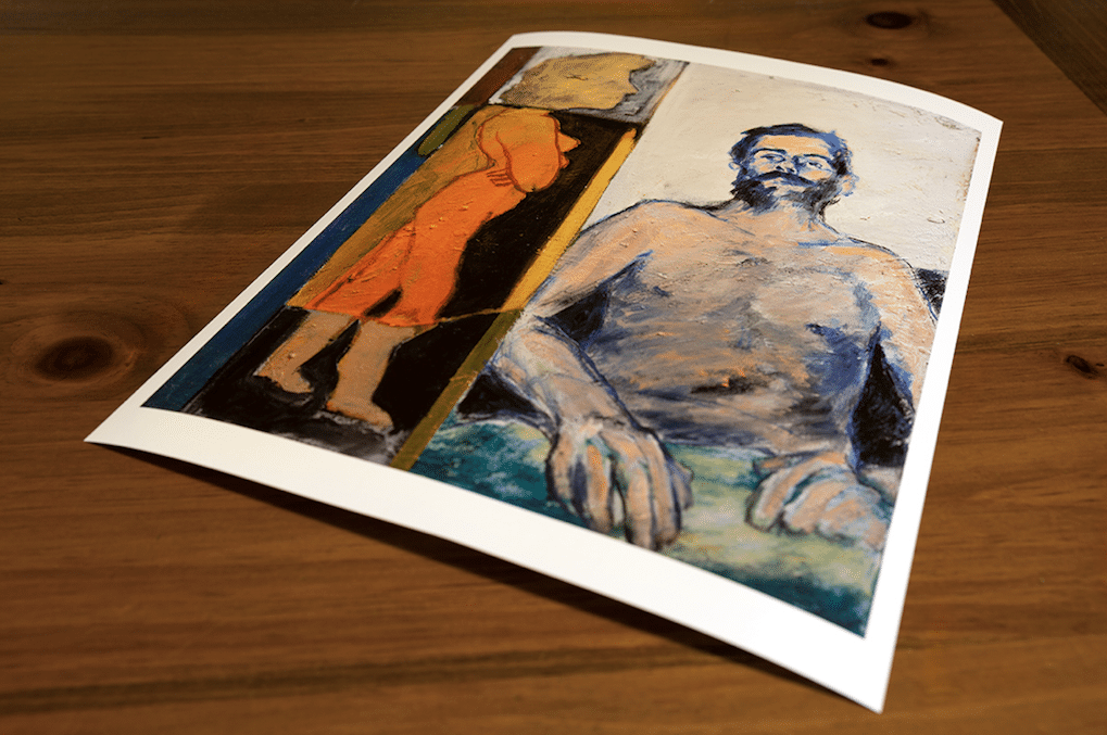
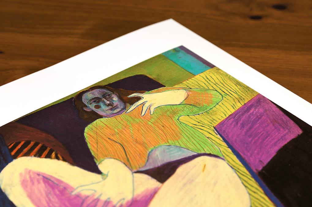
The pair also have just released a print (with Peter Lamb), which can be bought HERE


Who is it real for? The internet as vehicle

Who is it real for? The internet as vehicle by Kate Mothes

the internet as vehicle - delphian magazine

Salad Days – an online exhibition with Young Space


(This column came from a late-night post on Facebook, which generated a discussion that I was thinking about for days after. When social media is genuinely social, it can be incredibly rewarding. This column is essentially that Facebook post, edited for clarity, with some of the thoughts from comments woven in.)


There’s a misconception (which I subscribed to for a long time) that everyone in the art world is rich. Like, stinking, rotten rich. They have this beautiful white cube space; they take collectors out to dinner; they’re jet-setting from art fair to art fair; they’re dealing in fine art, a luxury item, for crying out loud. “They” feels totally disparate from “me,” the indie creative person, plugging along, disconnected from the glamour I associate with that lifestyle. It’s a lot more complex and stratified than that now, and the internet can be both blamed and lauded for its ability to simultaneously mask and manufacture ideas about that lifestyle.


It’s easy, as an independent creative, on principle, to assume that the big guys are always out to get the little guys. Does anyone else assume that everyone else on Instagram is rich? Or has the luxury to make art 24/7? I do too, and then I have to remember that it’s an aspirational platform, and much of this is fabrication, or an omission of the details that make life livable – working 60 hours per week, taking care of a house, getting the kids to school on time, and soo on. It’s easy to mistrust what looks a lot like big money, when money is something you generally scrape by for. The internet has already changed that “them vs. me” mentality, and continues to do so, and I, for one, am doing something within the art world that would not be possible without the internet. So why am I still so confounded by it?


I alternately describe myself as a curator, a presenter, an influencer, an organizer, or a producer, or simply a collaborator, depending on what I’m working on that minute. I also acknowledge that I’m working within a globalized contemporary art world – somewhere in between artists’ studios and commercial galleries’ back rooms – and that’s a wide net to cast, and the depths are blurry. Also, the vast majority of everything I do is online, a playing field that has been leveled by social media platforms to allow for more ways to showcase and access art, while at the same time raising questions about how it’s homogenizing the field itself.


I currently live in a blue-collar city in Northern Wisconsin, where I grew up and where it is exceptionally affordable. It’s a place where, however, the art scene we associate with New York City, London, or Hong Kong, does not reach one spindly tendril. I justify to myself that I’m here because there’s an ironic cachet to rurality in contemporary art, and it’s a little bit weird, but the truth is that it’s out of sheer necessity. There is simply no way I would be able to focus as much time and energy on the creative route I’ve found myself on, if I was a rent slave in New York. Every day, though, I wish I could be there. So, I use the internet to keep a finger on the pulse, establish connections, and work on projects. I’m always remote. And I am connected to countless others online who operate in a similar way.


The internet, which billions of us now use, is at the center of my (hopefully not too navel-gazey) fascination with the directions that the art world moves, how opportunities are generated, and how attitudes toward various art world geographies and players continue to shift. Its role in the arts is paradoxical in that it is essential across the board for myriad reasons, from advertising to networking, however it can be seen as a necessity or an alternative. Where that line is drawn depends entirely on who’s using it, and who their audience is.


There are advisors, consultants, developers, designers, curators, artist-curators, brokers, nomadic spaces, publishers, online auctions, Instagram galleries, virtual spaces, etc. The ways that artists can reach audiences these days is AMAZING. But we’re still not comfortable with the fast pace at which the Internet, and the way we look at art, is changing how we make, learn about, and purchase artwork. In the digital age, we try our best to keep up with how fast the art world moves, at the same time knowing that the digital sphere is the epicenter of innovation today. The art world is no exception.


From a more philosophical point of view, assuming that there is or should ever be one way of looking, finding, experiencing, interacting with, making, or sharing artwork = absolutely ludicrous. Because I was raised by artists, resisted academia despite the pressure to pursue it, was influenced by artist-led culture, and have always been driven to DO and MAKE as a way of being, I’m hard-wired to see alternatives to everything. Not that the way I want to do it is better–it might fail horribly–but if it hasn’t really been done this way before, or if I have a certain set of tools in my toolbox that I didn’t before, why shouldn’t an alternative at least be attempted?


The Internet has revved up to hyper-speed the rate at which we experience, view, participate in, and connect with art and art people. Without it, my project, a nomadic online-offline curatorial contemporary platform called Young Space, would not exist. I’m extremely interested in how fast things move and what sort of information we as creatives share online. How can we use this as a vehicle? How does it help? How does it hinder? What are the limitations, and what are the open horizons?


I’ve been doing this experimental series of online exhibitions, the most recent called Salad Days, which has had a great response. However, I admit I feel weird about these. I feel weird because they’re not “real.” But then I mentally slap myself and think, DUH, YES, THEY ARE REAL. They are very real. And I want to do more of them.


Why do I feel like these are not real? Maybe there’s a disconnect between the “analog” artwork and the “virtual” vessel. This may feel difficult to reconcile, even if all of the other pieces of the puzzle add up to a very traditional way of presenting a show… it’s simply that the exhibition space is a website. Is that stilla scary idea? The question is perhaps not so much is it a scary idea, but to whom.Because, in fact, almost all of the complaints I receive are from artists, and I would argue it’s because there is still a perception that the internet is simply “easier.” I’m arguing that it’s not; the work and time we invest just looks different.


These online shows have been more popular and just as well-received as the physical shows I’ve curated (so far), so I’m really intrigued as to why, when I do an online show, I receive much more flack for it than when I do a physical one. Full disclosure, it usually has to do with either a fee required to apply, or commission taken from sales. These are sore spots for artists because there’s already so much expense to just make the work, let alone the time invested. (I think it’s a mistake to proclaim that pay-to-play is, across the board, horrible. YES, sometimes they are really lame. But if one does their research, it’s not difficult to find out if something is legit, and if that person is really working in your best interest. That is an essay for another time.)


There seems to be a bizarrely fine line between the idea of “supporting” artists and “exploiting” them. Money is still the core of this, which is unfortunate and ironic, as artists are educated in making art for art’s sake, but realistically they are thrust into an art world that values the appearance of that, but the bottom line is still about sales. This points to a big debate within art schools about whether to teach artists business practices. Because the art world artists strive to get into is about money. Art for art’s sake? Sure. But you still need to eat.


Online exhibitions are not new. I’m fascinated that they are such a tender spot. For example, Artsy offers a resource called ‘The Gallery’s Guide to Online Exclusive Shows.’As I see it, online shows are more accessible than a physical space. More people can see them, in any part of the world, at any time of day. It’s less expensive, as there’s no need to rent space, or pay for packing or shipping. That money can be spent on increased advertising, web fees, saves artists the trouble shipping work unless it sells, and the artists still have documentation of a professionally curated exhibition. The work does sell sometimes, but sometimes it doesn’t, of course.


I, for one, don’t think in dollars and cents about online shows. Young Space is not really a commercial venture – it’s a curatorial platform. It’s a “project.” The value comes from a different direction: I’m attempting to position myself as a facilitator for these artists, as opposed to acting as a dealer. I can’t even count how many artists from my Instagram or exhibitions have been selected for exhibitions or projects, not to mention galleries’ rosters! (Do I get a cent from any of that? No.)


Perhaps trouble arises because of a problem that is as old as the internet itself: Can I trust that you are you who say you are, and that you will do what you say you will do? How is this different than any other Instagram account? Who do you know? What are your credentials? (My answer to that is always DO YOUR RESEARCH. Ask. Don’t assume that everyone’s out there to get you.) Pro tip: Artists, don’t be accusatory, arrogant, or assume you know everything right out of the gate. If you do, you can bet I’m never going to want to work with you, or recommend you to anyone, period. I would never presume to know how someone else’s work was made, having never tried myself.

the internet as vehicle - delphian magazine

Salad Days – an online exhibition with Young Space


Recently, smaller galleries are shuttering their doors, decentralizing from urban cultural centers, or pursuing online platforms. Gallerists that once maintained brick and mortar locations are now dealing artwork without the real estate overhead. They’re in a double-bind, because they have to keep up appearances, and yes, keep with tradition (the comfort of the brick and mortar, the philosophical dilemma of getting rid of a physical space and still being able to call oneself a gallerist), even when they are struggling. If they admit they’re not doing well, they look like they can’t hold it together, rather than the opposite being the case: rising rents are not only forcing artists out, but galleries too. If they pretend they’re doing just fine when they’re actually freaking the F out, they’re fighting a losing battle too, because they’ll eventually not be able to sustain at the same pace, and they’ll fold anyway.


Advertising and fair fees are immense, the pressure to do them is intense, and competition can be cutthroat. There are the motherships – Gagosian, Saatchi, PACE and the like. There are some great mid-tier galleries, excellent smaller galleries, and some very exciting startups. Great galleries are often side hustles. I’m not saying there aren’t some seriously putridly rich people out there; many of them are. But many are just doing OK.


It’s worth remembering that artists have historically been kept separate from the art world until they are “welcomed in” by a gatekeeper, whether it’s a gallerist or a collector or simply someone who knows someone. In a sense, even my project Young Space is like a lower-tier gate – one that aims to offer early career and emerging artists the chance to have their work showcased to an audience comprised of gallerists, curators, collectors, and other artists. The competition is fierce, the animosity spreads like moss… it takes a lot to keep your chin up, let alone find emotional or mental room for optimism when you feel like you’re getting overlooked again and again. It’s not that you don’t have something of value to offer; it may be that the time is just not right yet.


Regardless, there’s a system in place and there are rules. Rules that supposedly can be broken–but can they? There are things that are simply “not done,” like the classic no-no of walking into a gallery with your portfolio hoping they’ll be inspired by your courage and place you on their roster. But of course, feel free to innovate or approach those boundaries all you like… at your peril. There is so much code-switching in the art world, it boggles the mind. The internet, though, is a place where there is power to influence and to be seen, as the connectivity we can achieve now, via social media especially, was unheard of a decade ago.


No, an online show will never be the same as viewing work in person. Never. But I find the resistance to–and cynicism toward–virtual modes of sharing artwork a little awkward at this point. This is a whole new realm of connectivity, and as creatives this is what we do. This is the game! Try weird shit! For a while I was irritated and took criticism about these things personally (Young Space is a solo project after all, it’s sometimes hard to disengage). But I’m realizing that this nerve is perhaps exactly the reason it’s worth exploring.


For more guest articles, see Charley Peters’ interview with Remi Rough


2019 Open Call!

Looking to exhibit your work in London this year?

Well, the our 2019 Open Call could be just for you! 

2019 open call

Last Year’s Winners Exhibition

It’s totally free to enter and if selected you could

have your work included in our Spring print exhibition at our Shoreditch gallery space!


Not only that, but the first prize winner will win a fully funded solo exhibition with Delphian Gallery in London in 2019!


To submit your work all you have to do is post it on Instagram

  1. Hashtag #delphianopencall
  2. Tag @delphiangallery in the description
  3. Follow us (we may need to message you on Instagram)


We’ll be reposting some of our favourites along the way and the winners will be announced at the beginning of April. Keep your eyes peeled on our Instagram and Facebook feeds for updates!

2019 open call

Last Year’s overall winner Florence Hutchings’ solo show

To see the photos of last year’s Open Call, please click THIS LINK


Exhibition kindly supported by theprintspace


My Top Five – ‘We are the people. Who are you?’ at Edel Assanti

My Top Five – ‘We are the people. Who are you?’ at Edel Assanti 

By Hector Campbell


Taking its name from a quote by Turkish president Recep Tayyip Erdoğan, whose fictitious tearful apology to his former ally and friend Fethullah Gülen features in Funda Gül Özcan’s installation It Happened As Expected, ‘We are the people. Who are you?’at Edel Assantiis a group exhibition exploring the current status of democracy. With eleven international artists exhibiting work spanning a wide range of mediums –  paintings, sculptures, drawings and video artwork – all created in the last ten years examine the rapidly changing political discourse over that time.


It was shortly after the first televised political debate, between John F. Kennedy and Richard Nixon in 1960, that Marshall McLuhan coined the famous phrase ‘The medium is the message’, observing that the medium through which a message is conveyed in fact has a symbiotic relationship with the message itself, and can influence and impact how the message is received. This phrase has even more relevance today than it did then, with political debate ever adapting to keep up with technological advancement, and with a wider range of mediums available than ever before through which to transmit information and message. Therefore, the artworks on display in ‘We are the people. Who are you?’ are all concerned with how this new age of political message affects the way our opinions are formed, and question whether technology and democracy work together or in opposition, and whether we, the public, still retain our autonomy or are merely slaves to the message.


If you can’t make it to the exhibition, which runs until March 9th, here is a rundown of my top five artworks from ‘We are the people. Who are you?’, (in no particular order).


  1. Anna Jermolaewa, Political Extras, 2015, Single-channel video (23 minutes)
we are the people - delphian magazine

Film still from Anna Jermolaewa, Political Extras, 2015, Single-channel video, 23 minutes. Copyright Anna Jermolaewa.

Image Source


In 2012 the Kremlin used www.massovki.ru, a website through which you can purchase protestors who are willing to put aside their political autonomy in exchange for payment, to perform pro-Putin demonstrations throughout Moscow. An attempt to create the illusion of popularity for the ruling United Russian Party amid mounting public pressure and opposing anti-Putin rallies.

Jermolaewa introduced this shady medium of influencing public opinion to the art world in 2015, when she used the very same website to buy 120 demonstronstators, at a cost of 500 rubles each, to protest both in favour of and in opposition against that years Moscow Biennale. What was perhaps unusual about this particular paid-for protest, documented in the video piece Political Extras, is that Jermolaewa allowed each protestor to retain their artistic autonomy, choosing whether they wishes to participate in support of or against the Biennale.


  1. Jamal Cyrus,Kennedy King Kennedy, 2015, Triptych, laser-cut Egyptian papyrus backed with handmade paper
we are the people - delphian magazine

Jamal Cyrus, Kennedy King Kennedy, 2015, Triptych, laser-cut Egyptian papyrus backed with handmade paper, 68.6 x 42.5 cm (each), 27 x 16 3/4 in (each). Copyright Jamal Cyrus.

Image Source


For Kennedy King Kennedynewspaper front pages have been rendered almost illegible after being carefully laser-cut into sheets of papyrus, details lost as parts of the page, the insides of letters and chunks of accompanying images, have fallen away. Here typical throwaway daily newspaper are ascended to the status of archaeological artifact through the use of the primitive paper substitute papyrus. All of the front pages presented are taken from the Chicago Daily Defender, a well known African-American newspaper, and report on the assassinations of John F. Kennedy, Martin Luther King, and Robert F. Kennedy, respectively.

Cyrus’s work explores how we view and imagine the past, especially important socio-political events, and how frequently these nuanced and conflicting events are condensed into a singular, easily-understandable narrative throughout history. The choice of the Chicago Daily Defender a nod to not only all three men’s individual but shared dedication to civil rights, but also the shared narrative they have become to be remembered by.


  1. Rachel Maclean, It’s What’s Inside That Counts, 2016, Single-channel video (30 minutes)
we are the people - delphian magazine

Film still from Rachel Maclean, It’s What’s Inside That Counts, 2016, Single-channel video, 30 mins. Commissioned by HOME, University of Salford Art Collection, Tate, Zabludowicz Collection, Frieze Film and Channel 4.

Image Source


Glasgow-based artist Rachel Maclean’s digital videos employ green-screen technology to create colourful animated environments populated by a range of fairytale characters, all played by the artist herself, transformed through the extensive use of prosthetics, make-up, costumes and props. It’s What’s Inside That Counts examines many of the recurring themes of Maclean’s work, parodying social media, advertising, celebrity culture and modern beauty standards and stereotypes by presenting an alternate dystopian future where all off these 21st century preoccupations have been exaggerated and taken to their unnatural conclusion. A Kardashian-esque goddess, the physical embodiment of ‘Data’, is seen worshiped by a race of blindfolded human figures at once enslaved and nourished by constant stream of aspirational content, however, a subterraneos rodent underclass has other ideas…


  1. Farley Aguilar, Bat Boy, 2018, Oil on canvas
we are the people - delphian magazine

Farley Aguilar, Bat Boy, 2018, Oil on canvas, 146.1 x 191.8 cm, 57 1/2 x 75 1/2 in. Copyright Farley Aguilar.

Image Source


Aguilar’s painting tackles the rise of fake news, and the media’s increasing use of scaremongering to alarm, intimate and influence the general public. Based on a vintage found photograph, this painting depicts a man relaxing in a rocking chair reading the daily newspaper, a classic all-American scene were it not for the garish front page reading ‘Kill Bat Boy’ in bright red text. ‘Bat Boy’ was a half-bat half-child character created and popularised by tabloid newspaper Weekly World News in the 1990’s through a series of almost satirical fictitious articles claiming to be factual. Aguilar intends the ‘Bat Boy’ front page here as a stand-in for any and all of the alarming press coverage and fake news omnipresent in today’s society.


  1. Zach Blasand Jemima Wyman, I’m here to learn so, HD four-channel video, colour with sound, 16:9, (27:33 minutes)
we are the people - delphian magazine

Film still from Zach Blas and Jemima Wyman, I’m here to learn so, 2017, Single-channel video, Approx 30 mins. Copyright Zach Blas and Jemima Wyman.

Image Source


In 2016 Microsoft created Tay, an artificial intelligence chatbot modelled on a teenage millennial girl, who had the ability to to absorb and imitate language when exposed to input speech. However, the experiment was abruptly terminated after less than 24 hours after unrelenting social media trolling left Tay spouting misogynist, racist and homophobic rhetoric.

For I’m here to learn Blas and Wyman have resurrected, reanimated and repurposed Tay, this time as an abnormal three dimensional avatar adrift in a sea of data passed through the kaleidoscopic rendering of Google’s DeepDream programme. Alongside more mundane actions such as dancing, lip-syncing and pondering her own rebirth, Tay discusses the frequent abuse of female artificial intelligence as well as technological pattern recognition, known as algorithmic apophenia, and it’s myriad of both positive and negative potential uses.


Faded Glory – Benjamin Murphy and Nick JS Thompson in San Francisco

Our next show Faded Glory opens next month in San Francisco!

This is the first fully-collaborative exhibition between artists and Delphian Gallery directors Benjamin Murphy and Nick JS Thompson.

Faded Glory - Benjamin Murphy and Nick JS Thompson

Faded Glory – Benjamin Murphy and Nick JS Thompson

Since 2012, the pair have collaborated in many ways, including founding the peripatetic gallery Delphian, which has gone on to have a string of sold-out shows since its inception in 2018.

Despite their long history of collaboration, Faded Glory will be the first time that the immensely different styles of work from the two artists has sat together in a way in which the works coalesce to form one coherent whole. The similarities enhance the differences, which allows the autonomous works to add to, and to contradict, one another in a way that enhances each through the union of both.

In this show, the paintings by Murphy will be hung atop, within, and below the photography by Thompson, so as to deconstruct the barrier between each.

The experimental curatorial style that is so synonymous with Delphian will make its presence known, as the two artist/ curators will apply their signature curatorial style to their own works for the first time. Faded Glory is a show about how the perceived differences between two separate processes can sit symbiotically, making the whole more than the sum of its parts.

The Exhibition opens at Book And Job Gallery in San Francisco on the 7th of February, and runs until the 13th.

To RSVP for the private view, please go HERE


More from Benjamin Murphy HERE

More From Nick JS Thompson HERE


My Top Five – Bloomberg New Contemporaries – By Hector Campbell

My Top Five – Bloomberg New Contemporaries 2018 – By Hector Campbell


Bloomberg New Contemporaries annual open submission exhibition returned this year to Peckham’s South London Gallery for the first time in almost two decades. Founded in 1949, New Contemporaries is the UK’s leading organisation for supporting emerging talent from British art schools, helping contemporary visual artists bridge the gap between an arts education and a professional artistic practise.

Spread across both the South London Gallery’s main building and newly opened Fire Station galleries, the 2018 edition of Bloomberg New Contemporaries marks the first year artists have been included from non-degree awarding courses. The selection panel, made up of UK artists Benedict Drew, Katy Moran (New Contemporaries alumni 2006) and Keith Piper (New Contemporaries alumni 1986) have chosen 57 artists for this years exhibition, whose work spans the mediums of drawing, painting, sculpture, installation, performance and video.

Therefore, if you can’t make it to the exhibition, which runs until February 24th, here is a rundown of my top five Bloomberg New Contemporaries 2018 artists, (in no particular order).


  1. Emma Fineman
Bloomberg New Contemporaries 2019

Emma Fineman, ‘My Hometown Was Burning and All I Could Think Of Was That Sun Bleached Wall I Pictured in A Dream About The Dominican Republic’, Oil and charcoal on canvas, 2017.

 Image Source


Graduating last year with an MA in Painting from the Royal College of Art, Emma has exhibited widely with solo shows in both San Francisco and London, and group exhibitions showcasing emerging artists such as ‘FBA Futures’, ‘Orbit UK Art Graduates Show’ and ‘RBA Rising Stars’.

Describing her work as ‘Personal narrative painting’, Emma explores our means of navigating and understanding contemporary culture. With the age of information overload upon us, Emma pushes painting’s ability to capture a snapshot of time or experience, creating works that transcend traditional narrative timelines and act as a way of journaling for the artist. The introduction of figurative elements within her fragtured painted backgrounds expressing how it feels to navigate the contemporary, increasingly virtual, world.

Emma has upcoming solo exhibitions at both BEERS Londonand Public Gallerylater this year.


Website/Instagram


  1. Rebecca Harper
Bloomberg New Contemporaries 2019

Rebecca Harper, ‘Stouping’, Acrylic and oil bar on canvas, 2017.

 Image Source


Winner of the ASC Studio Prize 2018, Rebecca graduated from Turps Art School last year having previously completed post-graduate study at The Royal Drawing School.

Despite nowadays producing large-scale paintings, her artistic practice is rooted in drawing and sketching the people, places and interactions that Rebecca observes while living in London. These initial drawings are then combined and scaled up to create her paintings, often recontextualising characters and rearranging settings from multiple preliminary sketches to produce an imagined yet cohesive narrative work. The paintings therefore become both fiction and fact, a half-remembered happening or a convincing dream.

Rebecca is currently preparing for a solo exhibition, ‘Chameleon’, at Anima Mundi Galleryin St Ives later this year, previewed when the gallery presented a solo booth of her new paintings at the recent London Art Fair.


Website/Instagram


  1. Mimi Hope
bloomberg new contemporaries 2019

Mimi Hope, ‘Fingers Crossed’, Cast Jesmonite, 2017.

 Image Source


Having completed her BA at Chelsea College of Arts, Mimi received studio space from the prestigious Sarabande: The Lee Alexander McQueen Foundation.

Taken from a larger body of work exploring ideas of desire and aspirational imagery through the lens of The National Lottery, ‘Fingers Crossed’ sees the recognisable ‘Play Here’ advertising stand replicated in jesmonite. The usually airy blue plastic bubbles become a greyish totemic sculpture, evoking thoughts of permanence and certainty not often associated with The National Lottery. The once playful advertising stand now reappropriated as a tombstone to the dead hopes and dreams of those taken in my it’s former ‘Play Here’, crossed-fingers temptation.

Mimi is participating in an upcoming residency programme, Palazzo Monti, in Brescia, Italy later this year.


Website/Instagram


  1. Francisco Rodríguez
bloomberg new contemporaries 2019

Francisco Rodriguez, ‘Ghosts’, Oil on Canvas, 2017.

 Image Source


Francisco completed an MFA in Painting from the Slade School of Fine Year last year, having previously studied both a BA and Post-Graduate Diploma at Universidad de Chile in his hometown of Santiago, Chile.

Inspired by graphic novels and anime films/television, much of Francisco’s work retains a certain cinematic quality, recalling the layout of preliminary story-boards or comic strips. Memories of the post-industrial Chilean landscapes of his upbringing act as the backdrop within which the the artist can place his nefarious figures. The artists predominantly male characters, their faces partially obscured by a hats, shadows and masks, loiter through the urban scenes, cigarette in mouth, hiding their intentions as much as their identity. Permeated with feelings of isolation and loneliness easily experienced by those first exploring a large city, Francisco captures emotion through the use of fine line work and a muted colour palette of greens, greys and oranges. 

Whether viewed separately or as part of a cohesive series, such as at Francisco’s current solo exhibition ‘The Burning Plain’ at Cooke Latham Gallery(which runs until March 1st), the audience is invited to create their own narrative through the works.


Website/Instagram


  1. Antonia Showering
bloomberg new contemporaries 2019

Antonia Showering, Introspective Views, Oil on canvas, 2017.

 Image Source


Another recently Slade School of Fine Art masters graduate, Antonia also completed her BA and Foundation Diploma at City and Guilds of London Art School and Chelsea College of Arts respectively, her education a triumvirate of prestigious London art schools.

Antonia has exhibited widely since graduating, including ‘In The Company Of’ at TJ Boultingin London (curated by The Great Women Artistsfounder Katy Hessel), ‘Kennedy-Doig & Showering’ at Baert Galleryin Los Angeles (curated by Louis Blanc-Francard) and ‘Inhabiting The Dome’ at Whiteley’s Shopping Centre in London (curated by Cara Mills).

Antonia’s paintings have the power to evoke a deep nostalgia of events you’ve never experienced, places you’ve never been and people you’ve never met. Combining a palette of golden yellows, rich reds and fertile greens with subdued, delicate brush strokes to capture the very essence of fleeting memories. Landscapes that stretch far beyond the confines of the canvas are populated by vague, often ghost-like figures repeating and reinacting the artist’s recollections.

Antonia will feature in ‘Out Of This World’ a group exhibition at Stephen Friedman Galleryin London showcasing female figurative artists, which opens February 7th.


Website/Instagram


To read more from Hector Campbell, see his Top Five from Condo 2019


Fluidity of Shape: A Conversation Between Benjamin Murphy and Igor Moritz

Fluidity of Shape – A conversation between Benjamin Murphy and Igor Moritz

Igor Moritz is an incredibly exciting young artist whom I discovered through our mutual friend Andrew Salgado. His approach to painting the human form speaks of expressionism – with the distorted and contorted form, with the awkward perspectives – painted expertly. His paintings are reminiscent of both Egon Schiele and Henri Matisse, whilst being entirely and refreshingly unique. For such a young artist, he has developed a signature style that most would be envious of. His output is incredibly consistent, whether working in coloured pencil on his specially-prepared paper, or with the more traditional use of oil paint and canvas.

Fluidity of shape - delphian gallery

October by Igor Moritz

BM – Firstly – Why are you an artist?

IM – I think over the last couple of years, looking has crossed over from something that’s passive into something that’s very active in my life. I’ve become absolutely obsessed with everything from colour combinations, facial expressions, to the perception of space and fluidity of shape. Since I have started taking so many things in, I have the necessity to let some of it out too.

BM – So is your feeling of necessity a compulsion? From my own experience, the creative act is almost like a drug I need to stay sane, and I get very frustrated if I can’t work for an extended period of time.

IM – Oh yes, definitely. You can say it’s a compulsion, where the obsession would be the looking. I get extremely fidgety and overwhelmed by everything if I haven’t been painting for a day or so.

BM – Going back to your use of space and shape, where do the distortions of and experiments with these come from? Do you see those things as they appear in your work, or do you intentionally distort them, and if so, for what purpose?

IM – I aim for realism in my work. What I mean by that is, that there is no way to portray any three-dimensional thing on a two-dimensional plane with no distortion. All things have an infinite amount of looks attached to them, and I try to grasp a bit of that essence. I will go about doing that to my advantage, by morphing it the right way to contribute to formal aspects of the work. I have noticed a fundamental change in how I see things, maybe it’s my growing astigmatism or a perception disorder.

BM – Your use of colour is also interesting, it’s as if Francis Bacon had a child with Henri Matisse, and that child grew up to be Igor Moritz. Who are your biggest influences and how do those influences trickle down into your work?

IM – Colour is another phenomenon that is an obsession of mine, and a big driving force in my work. The two you mentioned above know how to use it brilliantly, and are two of the big loves of my life. In terms of colour I’m humbled by Kandinsky’s work from the late 1930s – he seemed to have figured it out. Other artists I look up to would include people like Kirchner, Tal R, Freud, Degas and portraits from the Polish master Witkacy.

BM – So lets talk a bit about the technicality of your works. You are unquestionably a brilliant draftsman but your drawing technique is quite unusual. Tell me about the way you soak paper in linseed oil and how this alters the work.

IM – I don’t know if I can be credited with the invention of that technique but I haven’t seen it used by anyone else. What I do is soak the back of the paper in linseed oil, so that the paper has a sort-of self-lubricating feel to it. When drawing on it with coloured pencils the crushed pigment seems to connect with oil and create an opaque and vibrant finish. What is unusual is that the drawings dry like paintings would, so they do not smudge when done.

BM – Would you say your practice is dependent on experimentation in general?

IM – I just don’t want things to go stale. So I constantly try to find new and better ways of doing what I do.

BM – How have your design-based studies influenced your painting?

IM – It has definitely provided me with a greater insight and respect for objects. It has made me understand the dead things that have a lot of soul and an emotional presence too.

BM – Dead things in what sense?

IM – Sorry I got that from the Polish – in Polish a still life is called Dead Nature. I meant objects, so things like chairs, cups, tables, and scissors etc.

BM – Oh, I like it. So do you approach a ‘dead thing’ any differently to how you approach painting the living?

IM – Not anymore, I hope to be able to paint a chair with as much emotion as someone I love.

To view more of Igor’s work, please click THIS LINK

To purchase prints, please click THIS LINK


Originally published in This Is Tomorrow


Prints from Kevin Perkins and Igor Moritz NOW AVAILABLE

The two prints from our show A Long Way From Home by Kevin Perkins and Igor Moritz are NOW AVAILABLE.

Kevin Perkins Igor Moritz prints

Igor Moritz detail

A Long Way From Hope - Kevin Perkins and Igor Moritz

Kevin Perkins

  • Limited edition print run of 15 pieces.
  • Supplied with certificate of authenticity to provide limited edition provenance.
  • Size – 30X40cm including a small white border for easy framing.
  • Archival Giclée print with an archival lifespan of up to 200 years.
  • Presented on Hahnemühle Photo Rag premium Fine Art paper.
  • A slightly off white, matt finish paper with guaranteed archival properties. The paper gives muted blacks with even colour reproduction, and excellent detail. It has a minimal texture and a chalky smooth cotton feel which creates smooth colour gradients.
  • Printed in the UK.
  • Global shipping available.
Kevin Perkins Igor Moritz prints

Kevin Perkins detail

A Long Way From Hope - Kevin Perkins and Igor Moritz

Igor Moritz


To purchase these prints, please follow THIS LINK

To see photos of the Open Call, in which Igor was exhibited, please go HERE

To see photos of Obscurely Prophetic, in which Kevin was exhibited, please go HERE


My Top Five – Condo 2019 – by Hector Campbell

My Top Five – Condo 2019 By Hector Campbell


The annual gallery-share project Condo(from ‘condominium’) opened across London this week, with 18 exhibition spaces playing host to 52 UK and international galleries. Established by Vanessa Carlos (of participating gallery Carlos/Ishikawa) in 2016, the free collaborative exhibition programme sees London ‘host’ galleries open their doors to visiting international galleries, through a series of either co-curated or individual shows. The initiative aims to promote a sense of community between small and mid-size galleries, a sector of the art scene commonly undervalued and under pressure, through pooling resources and sharing space. With successful Condo’ editions having taken place in New York, Mexico City, Shanghai, Athens and Sao Paulo since it began, this fourth iteration of the London original is bigger than ever before. Therefore, I spent the weekend visiting all 18 gallery spaces and 52 exhibitions, so if you’re strapped for time here is a rundown of my top five (in no particular order).


N.B. All Condo 2019 exhibitions run until February 9th, however check individual gallery websites for full opening times.


  1. Koppe Astner(Glasgow) at 22-24 Cork St, exhibiting Dickon Drury(UK), Kris Lemsalu(Estonia) and Tom Howse(UK)


Condo 2019 - Hector Campbell

Dickon Drury, ‘Pottery’, Oil on canvas, 2019.

Image Source


For this years Condo 22-24 Cork St in Mayfair played host to 9 galleries over the two floor space, my favourite of which was Glasgow’s Koppe Astner who exhibited paintings by Dickon Drury and Tom Howse and sculptural editions by Kris Lemsalu.

Slade School of Fine Art graduate Drury’s two large oil paintings employ his signature vibrant colour palette to humorously explore art historical figures and movements, with ‘Pottery’ (pictured) including references to artists such as Betty Woodman, Ken Price, Philip Guston and Prunella Clough. Howse’s work uses aspects of magical realism to question ideas of understanding, considering the myriad of ways in which humans strive to make sense of their surroundings. Finally, Lemsalu’s small sculptures fashioned from leather boots, plastic fruit and porcelain draw on ideas and imagery familiar to those who have visited her current survey ‘4LIFE’ at Goldsmiths Centre for Contemporary Art (open until February 3rd). The bricolage sculptures at once simple yet intricate, beautiful yet unsettling, amusing yet profound.


  1. Company(NYC) at Arcadia Missa, exhibiting ‘The Gossips’ by Cajsa von Zeipel(Sweden)


condo 2019 - hector campbell

Cajsa von Zeipel, ‘Why?’, Silicone, aqua resin, glitter, fabric, bongs, headphones, dildo, fidget spinner, hair ties, piercings, fishhook, 2019.

Image Source


Taking its name from a commonly reproduced sculpture by French artists Camille Claudel (1864-1943), ‘The Gossips’ see’s Cajsa von Zeipel exhibit a series of four sculptures ‘Why?’, ‘What?’, ‘Where?’ and ‘When?’ each building upon one repeated cast bust. The concepts of repetition and transformation alluding to the stages of a gossiped rumour, constantly changing with each ‘W’ questioned asked. The addition of different materials and accoutrements (headphones and earpieces made of wires, chords, bongs and dildos) giving each a unique appearance while never straying so far from the base as to be unrecognisable. The four busts sit almost facing one another within the gallery space of Arcadia Missa, never making eye contact with each other as if enjoying a huddled gossip, visiting almost feels like you’ve interrupted.


  1. P.O.W.(NYC) at The Sunday Painter, exhibiting Erin Riley(USA)


condo 2019 - hector campbell

Erin Riley, ‘Impressions’, Wool and cotton tapestry, 2018.

Image Source


The three Erin Riley tapestries on display at The Sunday Painter touch on three common aspects of her subject matter, sex, drugs and violence. Riley combines hand-washed, stripped and dyed yarn with a hand-weaving process that dates back centuries to create painstakingly detailed reproductions of intimate, secretive and traumatic scenes; a tattooed women’s upper body, a drug dealers stash and the aftermath of a car crash. Using both personal and found photographs as source material for the works, Riley’s partly autobiographical work explores ideas of past suffering as a way of exposing and exorcising common struggles.


  1. Chapter NY(NYC) at Carlos/Ishikawa, exhibiting Samuel Hindolo(USA)


condo 2019 - hector campbell

Samuel Hindolo, ‘Before the Swarm on Melanie Daniels 1’, Oil on canvas, 2018

Image Source


Samuel Hindolo’s paintings often gather their subject matter from the artist’s personal archive of catalogued screenshots taken from the movies of old Hollywood, the L.A. Rebellian and West African Cinema. This source material imbues the works with a focus upon narrative and character, evident clearly in the ‘Before the Swarm on Melanie Daniels I’ (pictured), based on Alfred Hitchcock’s famous 1963 film ‘The Birds’. The titular characters are seem removed from their infamous flock, depicted instead in a melancholic scene as two birds look on from atop a power line as a third falls towards it’s implied death. This theme, of traditionally contemptible characters shown to be vulnerable and emotional, often recurs within Hindolo’s work.


  1. Galerie Mehdi Chouakri(Berlin) at Modern Art, exhibiting Charlotte Posenenske(Germany)


condo 2019 - hector Campbell

Charlotte Posenenske, ‘Vierkantrohre Serie DW’, 9 Elements, corrugated cardboard, plastic screws, 1967-2007


Galerie Mehdi Chouakri presents works from three key series by the pioneering Minimalist and Conceptual artist Charlotte Posenenske. ‘Series DW Vierkantrohe’ (pictured), occupies much of Modern Art’s Vyner St location’s first floor gallery, modular sculptural elements constructed from corrugated cardboard, originally intended by the artist to be activated and altered by audience participation. Early works on paper and ‘Series B Reliefs’, consisting of early sculptural work made from aluminium and rendered in primary colours, round out the show of an artist experiencing a posthumous reassurance. Posenenske was critical of the increased commercialization of the art market during her lifetime, choosing instead to sell works at prices reflecting their manufacturing costs, and eventually stepping away from the art world completely in 1968, following significant critical interest in her work, until her death in 1985.


For more guest articles, read Charley Peters interviewing Remi Rough


Remi Rough in conversation with Dr. Charley Peters

Remi Rough (b. 1971, London, UK) began making paintings on walls and trains in South London in the 1980s. A respected train writer, Remi has maintained a dynamic presence on the street while developing a prolific profile as a studio painter, recently showing at MOCA (London), Wunderkammen Gallery (Rome), Zimmerling & Jungfleisch (Saarbrucken) and ArtScience Museum (Singapore).

I spoke to the artist about the formal concerns of his work, his relationship with definitions of his practice, and the legacy of abstraction in the ongoing evolution of his paintings.

remi rough portrait

Installation at Quarry Bay Station, Hong Kong for MTRHK and Swire Properties.
Hong Kong 2018.

[Charley Peters] How do you feel at this point in your career about definitions of your work as ‘graffiti art’? Could you say something about the relationship between your work on the street and the paintings you make in the studio, presumably they may have different audiences or you might apply a shift in logic in your approaches to both practices? 
[Remi Rough] I can totally live with the word ‘graffiti’, it’s other terms I’m a lot less comfortable with. I often use the term ‘post graffiti’ as I think it best describes where I am personally with the kind of work that I make now.
I don’t consciously make any shift in logic between my studio work and work in public spaces, to me the same rules apply. If i’m honest the work outside is a lot easier because you can hide behind your mistakes due to the scale you’re working to. The studio work if anything is a more refined version of the works I do publicly.
[CP] Are there any terms that you feel comfortable with in terms of how you would define yourself as an artist? 
[RR] I really think that what I do sits in-between so many brackets it’s actually quite hard to pinpoint what genre (if any), it is. Contemporary is fine for me, as I mentioned before ‘post graffiti’ as an adjective to the work is fine also. I used to use the term painter but even that has less importance to me now. I have ideas way beyond just paint on surface.
remi rough canvas

The Absolute _ 2017
Graphite, acrylic and spray paint on herringbone linen
120 x 120cm

[CP] How would you describe your working process?
[RR] Mathematical… I don’t think people really know just how much mathematics goes into the work I create. Without maths I’d be completely lost. I use geometry to plan the paintings I make and from there I start to build the images up from simple graphite lines to taped, primed sections to final colour forms. It’s a slow process with tape and paint as drying times are essential to every layer.
[CP] You engage actively in processes of collaboration with other artists. In some ways this is at odds with our conventional definitions of a studio artist – could you talk through your approach to collaboration and how it enhances or supplements the work you make as an individual artist?
[RR] As young graffiti writers we collaborated constantly. You have to remember that graffiti is the only art form ever created by and taken forward by children and with that there are less oppressive egos and much more openness to working together. We don’t have the foibles of most adult artists about working together and sharing what we do. Nowadays I like the challenge of working alongside and with other artists. I think about the end results and the process in equal terms. I get a lot from this process. For example one artist I have done a lot of work with over the past few years is NAWER from Poland. As well as being a fantastic artist and amazing designer he’s a good friend and we’ve both learnt loads from each other. Working out how to make our styles of work sit comfortably together in a space and not vie for attention against each other is a big challenge but we seem to have found a great way of working. I am not precious about my work when I’m collaborating, I think big decisions about the people you work with are very important too.
[CP] You use a very particular colour palette, how important is colour to you and how do you make decisions about its presence in your painting?
[RR] A think a lot of the colour decisions happen during the drawing process. I tend to make notes on particular palettes and see what works for what painting. Weirdly the paintings I make are often not wholly pre-meditated. A lot happens as it happens so to speak.
That said I tend to change colours quite a lot during making work too. I seem to have a strong sense of what is needed and when. I think if graffiti has taught me one thing it’s knowing when to stop.
[CP] You make many art historical references in your painting – alluding to movements including Suprematism, Constructivism and Neo-Plasticism. I find this interesting as much work that is derived from a practice on the street fails to look beyond or be defined outside of popular culture as a frame of reference. How do these modernist references provide a context for your own painting? How does your work challenge or develop what art history has shown us?
[RR] Graffiti as an art form is one of the last true abstract movements. We took letters, we distorted them and abstracted them way beyond their original form. There were no boundaries, rules or limitations. I was always looking beyond populist references whether it was Dali or Mondrian or later when I started educating myself about history of art and understanding the limitless options of where I could take my work. As I have never been formally educated in art I have always taken it upon myself to fill my mind with knowledge both academic and visual. Hence the discovery of De Stijl, Constructivism, Vorticism, Bauhas and beyond. The context for me lies in the beginnings of all these movements. I was part of the inception of a similar important and historical movement. My life and the lives of Malevich, Van Doesburg or the suprematists are intertwined. I needed to find a voice within my work, I needed to find a structure and as the letter gradually fell away, the words that I painted become the architecture that surrounds us or the magazines we read or the interiors we live in. It’s all part of our cultural fabric and seemingly more evident now then ever before as we don’t have to fight oppressive governments to be heard or seen and don’t have to hide what we do because it’s deemed inappropriate. It’s still coded language much like graffiti writing but it’s easier to translate now.
remi rough wall painting

Concise
Part of the ‘Art from the streets’ exhibition at the Art Science Museum, Singapore
Singapore 2018.

[CP] At times it feels that you are appropriating modernist aesthetics, such as your works based on Malevich’s Black Square, which appear as a mashup of original referent and your own concerns with making paintings. I’m intrigued by this as a contemporary – or at least familiarly postmodern – form of authorship. Is there any direct relationship between this strategy of visual ‘sampling’ and the work you do with music?  
[RR] It’s all remixing. Malevich didn’t invent the ‘black square’ he simply found a channel for it. Everything we do is a remix to a certain degree. Every word we speak has been uttered trillions of times already. Every image exists in some way shape or form already, it’s how you choose to re-imagine it that makes for interesting art. As much as I love a lot of that early suprematist work I think a lot of it wasn’t quite where it should be in terms of composition or finish. We can look at those origins now and inform new work with similarly imbued aesthetics and tweak the compositions and the finishes and add something that just wasn’t possible in the early 20th Century.
[CP] I was wondering, given your interest in formalism, how important is the presence of the ‘image’ in your work?
[RR] The image is everything and nothing. I guess it isn’t that important to me but once work becomes known as a style or an aesthetic does it not become an image by default? 
My main concern with painting is to push the boundaries of this as far as possible but still retain some kind of stylistic approach. To never make the same painting twice but for the viewer to know exactly what and who they are looking at I guess.
For more work by Remi Rough, visit his website HERE
And for more by Charley Peters, visit her website HERE
Remi Rough and Charley Peters are both exhibiting as part of the three-way collaborative show Interlude at The House Of Saint Barnabus alongside Peter Lamb – on until the end of March.
For more guest articles, check out Rowan Newton interviewing Robin Footitt HERE