Articles Tagged with: delphian magazine

2019 Open Call!

Looking to exhibit your work in London this year?

Well, the our 2019 Open Call could be just for you! 
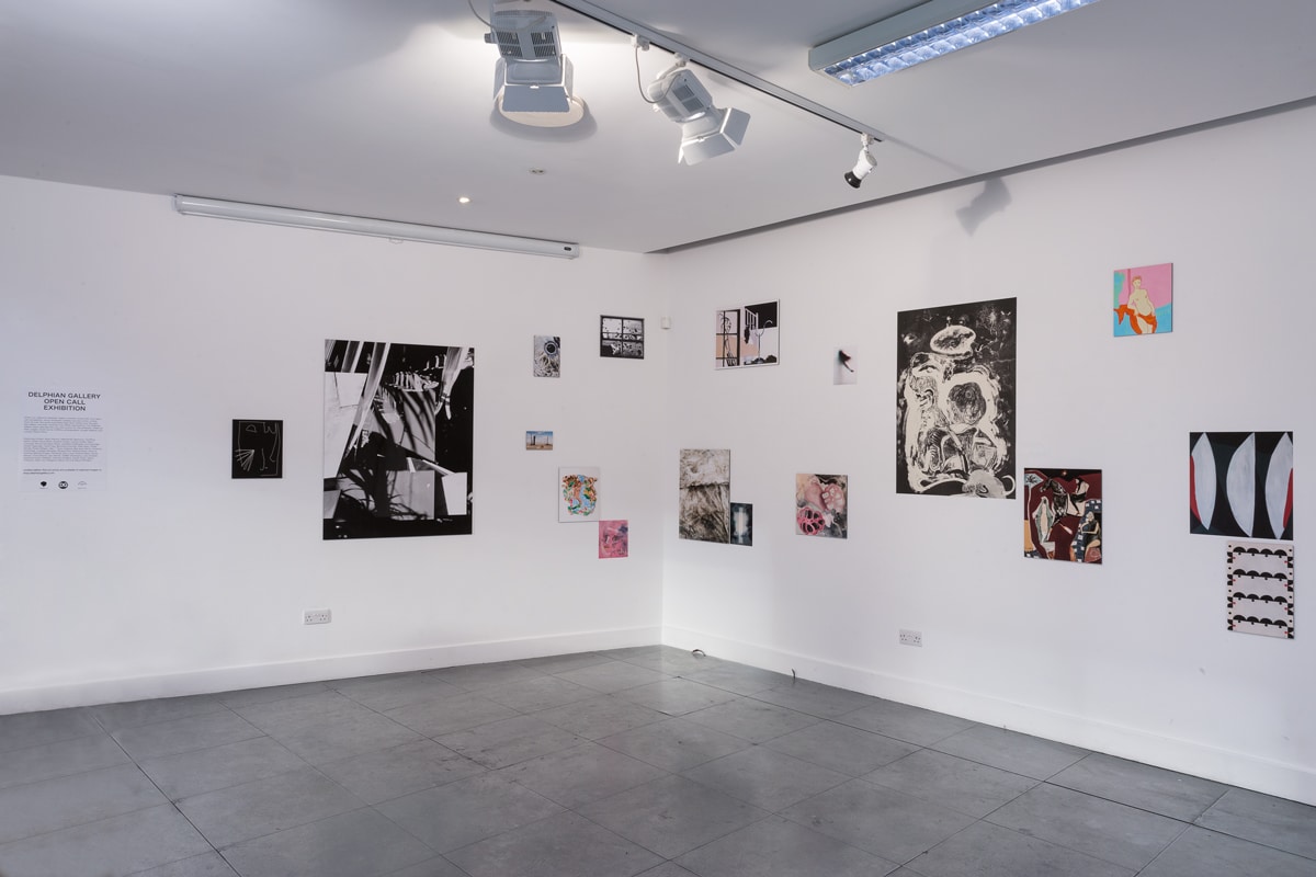
2019 open call

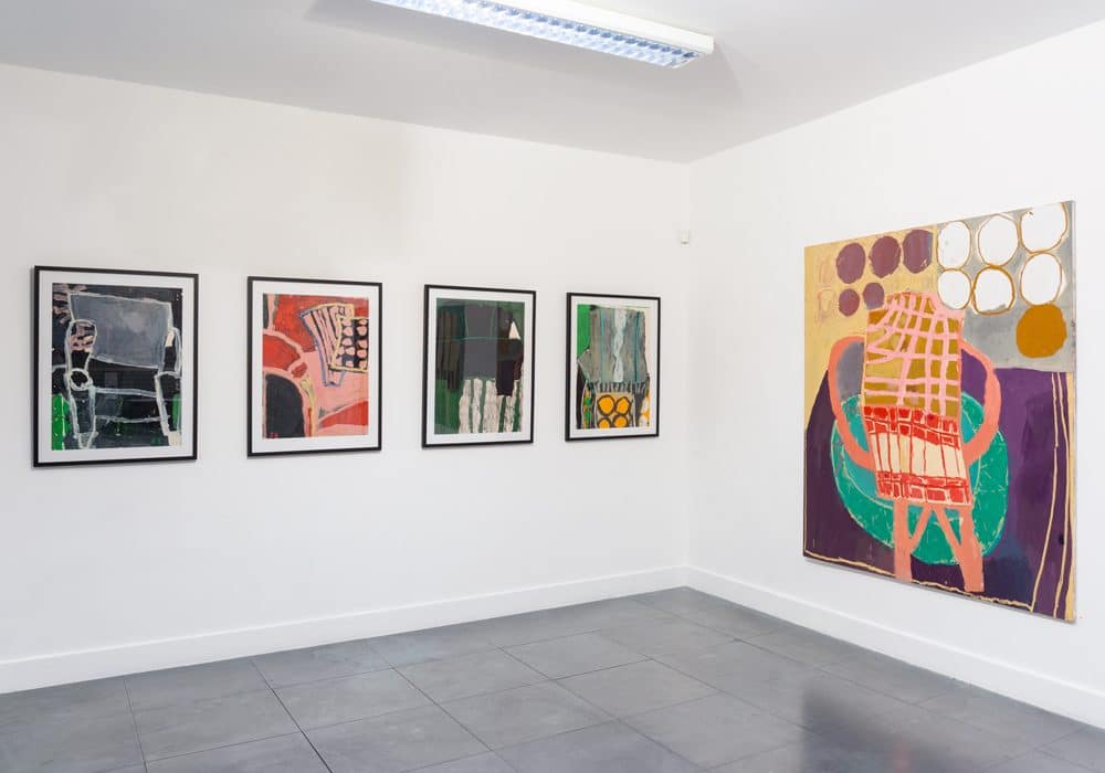
Last Year’s Winners Exhibition

It’s totally free to enter and if selected you could

have your work included in our Spring print exhibition at our Shoreditch gallery space!


Not only that, but the first prize winner will win a fully funded solo exhibition with Delphian Gallery in London in 2019!


To submit your work all you have to do is post it on Instagram

  1. Hashtag #delphianopencall
  2. Tag @delphiangallery in the description
  3. Follow us (we may need to message you on Instagram)


We’ll be reposting some of our favourites along the way and the winners will be announced at the beginning of April. Keep your eyes peeled on our Instagram and Facebook feeds for updates!
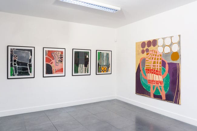
2019 open call

Last Year’s overall winner Florence Hutchings’ solo show

To see the photos of last year’s Open Call, please click THIS LINK


Exhibition kindly supported by theprintspace


My Top Five – ‘We are the people. Who are you?’ at Edel Assanti

My Top Five – ‘We are the people. Who are you?’ at Edel Assanti 

By Hector Campbell


Taking its name from a quote by Turkish president Recep Tayyip Erdoğan, whose fictitious tearful apology to his former ally and friend Fethullah Gülen features in Funda Gül Özcan’s installation It Happened As Expected, ‘We are the people. Who are you?’at Edel Assantiis a group exhibition exploring the current status of democracy. With eleven international artists exhibiting work spanning a wide range of mediums –  paintings, sculptures, drawings and video artwork – all created in the last ten years examine the rapidly changing political discourse over that time.


It was shortly after the first televised political debate, between John F. Kennedy and Richard Nixon in 1960, that Marshall McLuhan coined the famous phrase ‘The medium is the message’, observing that the medium through which a message is conveyed in fact has a symbiotic relationship with the message itself, and can influence and impact how the message is received. This phrase has even more relevance today than it did then, with political debate ever adapting to keep up with technological advancement, and with a wider range of mediums available than ever before through which to transmit information and message. Therefore, the artworks on display in ‘We are the people. Who are you?’ are all concerned with how this new age of political message affects the way our opinions are formed, and question whether technology and democracy work together or in opposition, and whether we, the public, still retain our autonomy or are merely slaves to the message.


If you can’t make it to the exhibition, which runs until March 9th, here is a rundown of my top five artworks from ‘We are the people. Who are you?’, (in no particular order).


  1. Anna Jermolaewa, Political Extras, 2015, Single-channel video (23 minutes)
we are the people - delphian magazine

Film still from Anna Jermolaewa, Political Extras, 2015, Single-channel video, 23 minutes. Copyright Anna Jermolaewa.

Image Source


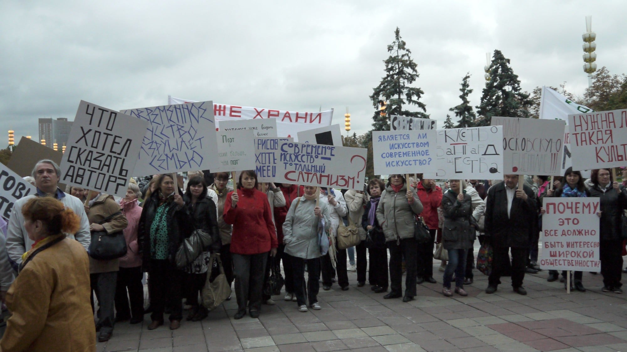
In 2012 the Kremlin used www.massovki.ru, a website through which you can purchase protestors who are willing to put aside their political autonomy in exchange for payment, to perform pro-Putin demonstrations throughout Moscow. An attempt to create the illusion of popularity for the ruling United Russian Party amid mounting public pressure and opposing anti-Putin rallies.

Jermolaewa introduced this shady medium of influencing public opinion to the art world in 2015, when she used the very same website to buy 120 demonstronstators, at a cost of 500 rubles each, to protest both in favour of and in opposition against that years Moscow Biennale. What was perhaps unusual about this particular paid-for protest, documented in the video piece Political Extras, is that Jermolaewa allowed each protestor to retain their artistic autonomy, choosing whether they wishes to participate in support of or against the Biennale.


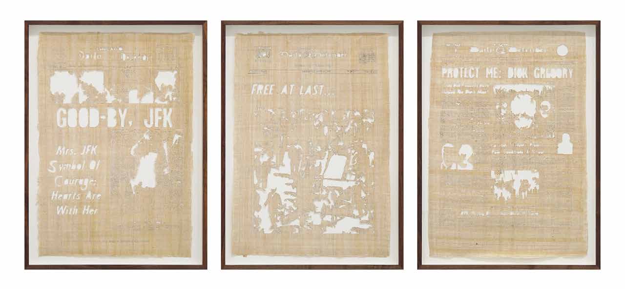
  1. Jamal Cyrus,Kennedy King Kennedy, 2015, Triptych, laser-cut Egyptian papyrus backed with handmade paper
we are the people - delphian magazine

Jamal Cyrus, Kennedy King Kennedy, 2015, Triptych, laser-cut Egyptian papyrus backed with handmade paper, 68.6 x 42.5 cm (each), 27 x 16 3/4 in (each). Copyright Jamal Cyrus.

Image Source


For Kennedy King Kennedynewspaper front pages have been rendered almost illegible after being carefully laser-cut into sheets of papyrus, details lost as parts of the page, the insides of letters and chunks of accompanying images, have fallen away. Here typical throwaway daily newspaper are ascended to the status of archaeological artifact through the use of the primitive paper substitute papyrus. All of the front pages presented are taken from the Chicago Daily Defender, a well known African-American newspaper, and report on the assassinations of John F. Kennedy, Martin Luther King, and Robert F. Kennedy, respectively.

Cyrus’s work explores how we view and imagine the past, especially important socio-political events, and how frequently these nuanced and conflicting events are condensed into a singular, easily-understandable narrative throughout history. The choice of the Chicago Daily Defender a nod to not only all three men’s individual but shared dedication to civil rights, but also the shared narrative they have become to be remembered by.


  1. Rachel Maclean, It’s What’s Inside That Counts, 2016, Single-channel video (30 minutes)
we are the people - delphian magazine

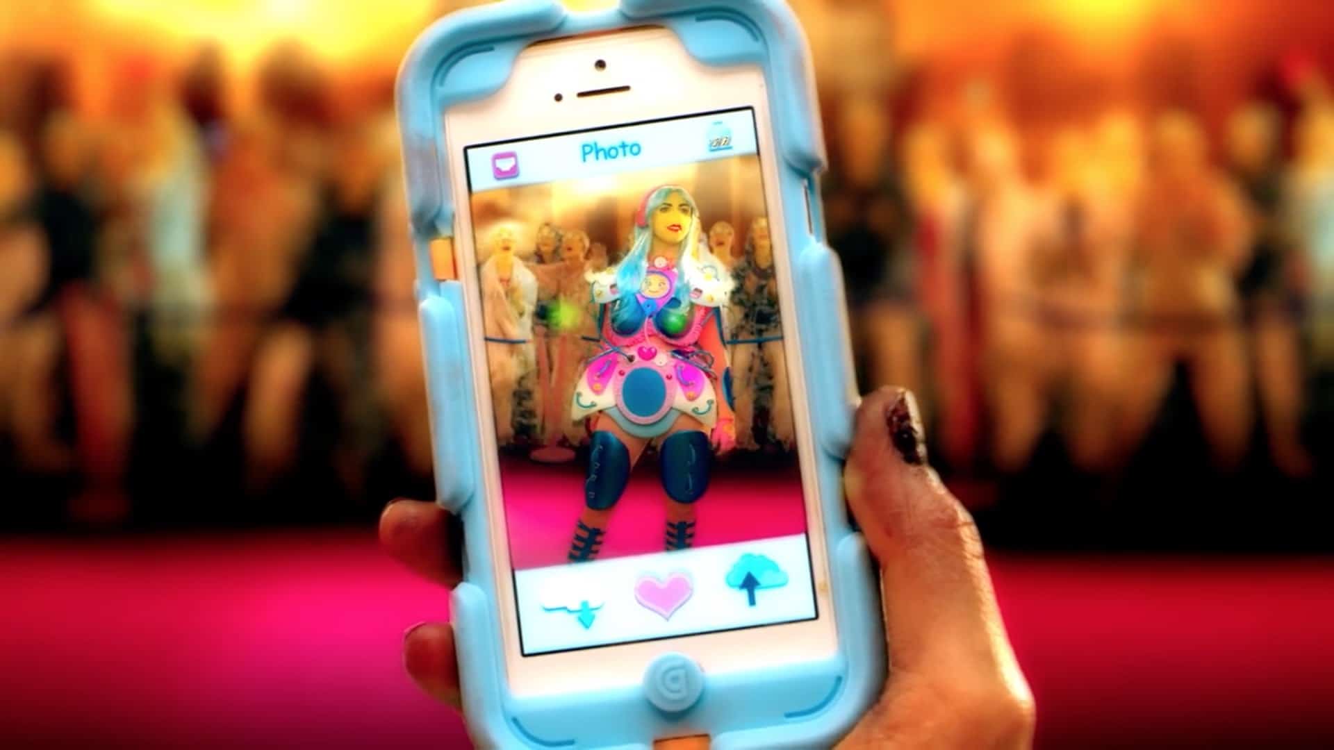
Film still from Rachel Maclean, It’s What’s Inside That Counts, 2016, Single-channel video, 30 mins. Commissioned by HOME, University of Salford Art Collection, Tate, Zabludowicz Collection, Frieze Film and Channel 4.

Image Source


Glasgow-based artist Rachel Maclean’s digital videos employ green-screen technology to create colourful animated environments populated by a range of fairytale characters, all played by the artist herself, transformed through the extensive use of prosthetics, make-up, costumes and props. It’s What’s Inside That Counts examines many of the recurring themes of Maclean’s work, parodying social media, advertising, celebrity culture and modern beauty standards and stereotypes by presenting an alternate dystopian future where all off these 21st century preoccupations have been exaggerated and taken to their unnatural conclusion. A Kardashian-esque goddess, the physical embodiment of ‘Data’, is seen worshiped by a race of blindfolded human figures at once enslaved and nourished by constant stream of aspirational content, however, a subterraneos rodent underclass has other ideas…


  1. Farley Aguilar, Bat Boy, 2018, Oil on canvas
we are the people - delphian magazine

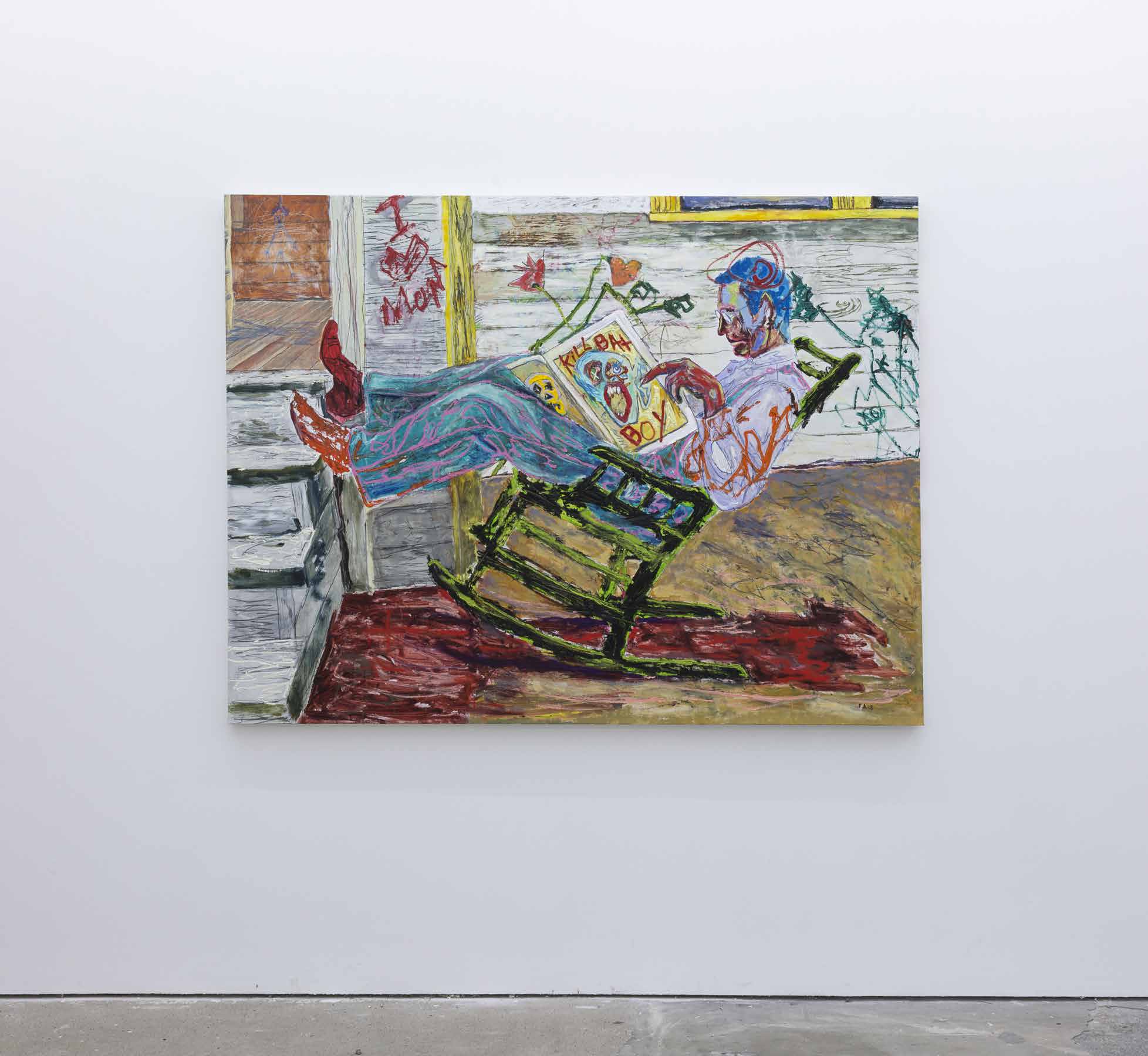
Farley Aguilar, Bat Boy, 2018, Oil on canvas, 146.1 x 191.8 cm, 57 1/2 x 75 1/2 in. Copyright Farley Aguilar.

Image Source


Aguilar’s painting tackles the rise of fake news, and the media’s increasing use of scaremongering to alarm, intimate and influence the general public. Based on a vintage found photograph, this painting depicts a man relaxing in a rocking chair reading the daily newspaper, a classic all-American scene were it not for the garish front page reading ‘Kill Bat Boy’ in bright red text. ‘Bat Boy’ was a half-bat half-child character created and popularised by tabloid newspaper Weekly World News in the 1990’s through a series of almost satirical fictitious articles claiming to be factual. Aguilar intends the ‘Bat Boy’ front page here as a stand-in for any and all of the alarming press coverage and fake news omnipresent in today’s society.


  1. Zach Blasand Jemima Wyman, I’m here to learn so, HD four-channel video, colour with sound, 16:9, (27:33 minutes)
we are the people - delphian magazine

Film still from Zach Blas and Jemima Wyman, I’m here to learn so, 2017, Single-channel video, Approx 30 mins. Copyright Zach Blas and Jemima Wyman.

Image Source


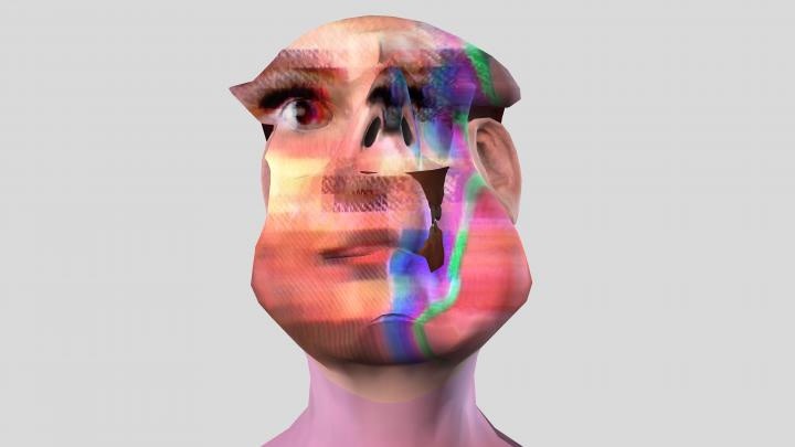
In 2016 Microsoft created Tay, an artificial intelligence chatbot modelled on a teenage millennial girl, who had the ability to to absorb and imitate language when exposed to input speech. However, the experiment was abruptly terminated after less than 24 hours after unrelenting social media trolling left Tay spouting misogynist, racist and homophobic rhetoric.

For I’m here to learn Blas and Wyman have resurrected, reanimated and repurposed Tay, this time as an abnormal three dimensional avatar adrift in a sea of data passed through the kaleidoscopic rendering of Google’s DeepDream programme. Alongside more mundane actions such as dancing, lip-syncing and pondering her own rebirth, Tay discusses the frequent abuse of female artificial intelligence as well as technological pattern recognition, known as algorithmic apophenia, and it’s myriad of both positive and negative potential uses.


My Top Five – Bloomberg New Contemporaries – By Hector Campbell

My Top Five – Bloomberg New Contemporaries 2018 – By Hector Campbell


Bloomberg New Contemporaries annual open submission exhibition returned this year to Peckham’s South London Gallery for the first time in almost two decades. Founded in 1949, New Contemporaries is the UK’s leading organisation for supporting emerging talent from British art schools, helping contemporary visual artists bridge the gap between an arts education and a professional artistic practise.

Spread across both the South London Gallery’s main building and newly opened Fire Station galleries, the 2018 edition of Bloomberg New Contemporaries marks the first year artists have been included from non-degree awarding courses. The selection panel, made up of UK artists Benedict Drew, Katy Moran (New Contemporaries alumni 2006) and Keith Piper (New Contemporaries alumni 1986) have chosen 57 artists for this years exhibition, whose work spans the mediums of drawing, painting, sculpture, installation, performance and video.

Therefore, if you can’t make it to the exhibition, which runs until February 24th, here is a rundown of my top five Bloomberg New Contemporaries 2018 artists, (in no particular order).


  1. Emma Fineman
Bloomberg New Contemporaries 2019

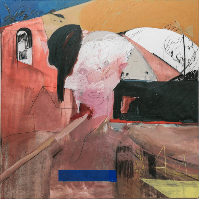
Emma Fineman, ‘My Hometown Was Burning and All I Could Think Of Was That Sun Bleached Wall I Pictured in A Dream About The Dominican Republic’, Oil and charcoal on canvas, 2017.

 Image Source


Graduating last year with an MA in Painting from the Royal College of Art, Emma has exhibited widely with solo shows in both San Francisco and London, and group exhibitions showcasing emerging artists such as ‘FBA Futures’, ‘Orbit UK Art Graduates Show’ and ‘RBA Rising Stars’.

Describing her work as ‘Personal narrative painting’, Emma explores our means of navigating and understanding contemporary culture. With the age of information overload upon us, Emma pushes painting’s ability to capture a snapshot of time or experience, creating works that transcend traditional narrative timelines and act as a way of journaling for the artist. The introduction of figurative elements within her fragtured painted backgrounds expressing how it feels to navigate the contemporary, increasingly virtual, world.

Emma has upcoming solo exhibitions at both BEERS Londonand Public Gallerylater this year.


Website/Instagram


  1. Rebecca Harper
Bloomberg New Contemporaries 2019

Rebecca Harper, ‘Stouping’, Acrylic and oil bar on canvas, 2017.

 Image Source


Winner of the ASC Studio Prize 2018, Rebecca graduated from Turps Art School last year having previously completed post-graduate study at The Royal Drawing School.

Despite nowadays producing large-scale paintings, her artistic practice is rooted in drawing and sketching the people, places and interactions that Rebecca observes while living in London. These initial drawings are then combined and scaled up to create her paintings, often recontextualising characters and rearranging settings from multiple preliminary sketches to produce an imagined yet cohesive narrative work. The paintings therefore become both fiction and fact, a half-remembered happening or a convincing dream.

Rebecca is currently preparing for a solo exhibition, ‘Chameleon’, at Anima Mundi Galleryin St Ives later this year, previewed when the gallery presented a solo booth of her new paintings at the recent London Art Fair.


Website/Instagram


  1. Mimi Hope
bloomberg new contemporaries 2019

Mimi Hope, ‘Fingers Crossed’, Cast Jesmonite, 2017.

 Image Source


Having completed her BA at Chelsea College of Arts, Mimi received studio space from the prestigious Sarabande: The Lee Alexander McQueen Foundation.

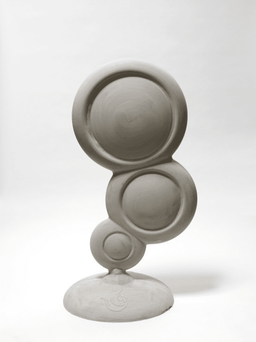
Taken from a larger body of work exploring ideas of desire and aspirational imagery through the lens of The National Lottery, ‘Fingers Crossed’ sees the recognisable ‘Play Here’ advertising stand replicated in jesmonite. The usually airy blue plastic bubbles become a greyish totemic sculpture, evoking thoughts of permanence and certainty not often associated with The National Lottery. The once playful advertising stand now reappropriated as a tombstone to the dead hopes and dreams of those taken in my it’s former ‘Play Here’, crossed-fingers temptation.

Mimi is participating in an upcoming residency programme, Palazzo Monti, in Brescia, Italy later this year.


Website/Instagram


  1. Francisco Rodríguez
bloomberg new contemporaries 2019

Francisco Rodriguez, ‘Ghosts’, Oil on Canvas, 2017.

 Image Source


Francisco completed an MFA in Painting from the Slade School of Fine Year last year, having previously studied both a BA and Post-Graduate Diploma at Universidad de Chile in his hometown of Santiago, Chile.

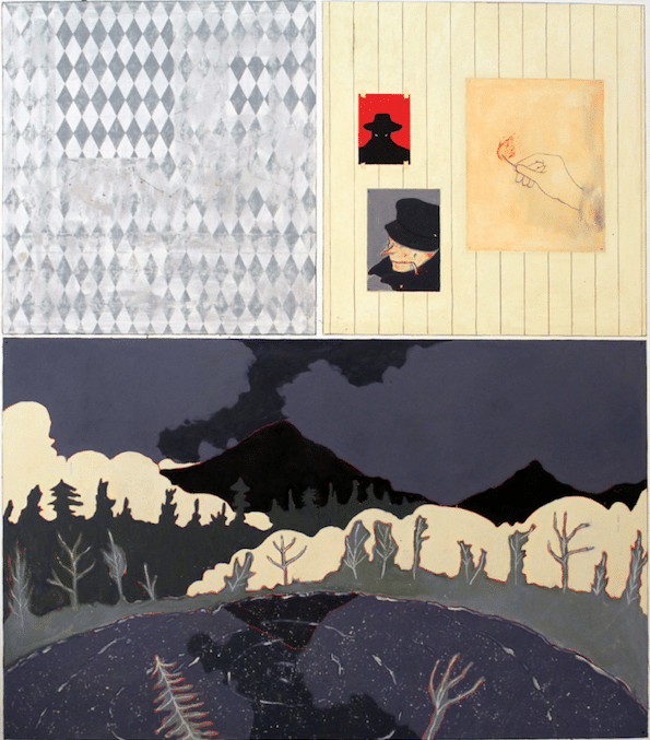
Inspired by graphic novels and anime films/television, much of Francisco’s work retains a certain cinematic quality, recalling the layout of preliminary story-boards or comic strips. Memories of the post-industrial Chilean landscapes of his upbringing act as the backdrop within which the the artist can place his nefarious figures. The artists predominantly male characters, their faces partially obscured by a hats, shadows and masks, loiter through the urban scenes, cigarette in mouth, hiding their intentions as much as their identity. Permeated with feelings of isolation and loneliness easily experienced by those first exploring a large city, Francisco captures emotion through the use of fine line work and a muted colour palette of greens, greys and oranges. 

Whether viewed separately or as part of a cohesive series, such as at Francisco’s current solo exhibition ‘The Burning Plain’ at Cooke Latham Gallery(which runs until March 1st), the audience is invited to create their own narrative through the works.


Website/Instagram


  1. Antonia Showering
bloomberg new contemporaries 2019

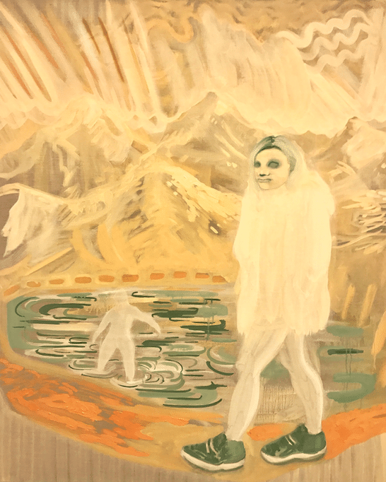
Antonia Showering, Introspective Views, Oil on canvas, 2017.

 Image Source


Another recently Slade School of Fine Art masters graduate, Antonia also completed her BA and Foundation Diploma at City and Guilds of London Art School and Chelsea College of Arts respectively, her education a triumvirate of prestigious London art schools.

Antonia has exhibited widely since graduating, including ‘In The Company Of’ at TJ Boultingin London (curated by The Great Women Artistsfounder Katy Hessel), ‘Kennedy-Doig & Showering’ at Baert Galleryin Los Angeles (curated by Louis Blanc-Francard) and ‘Inhabiting The Dome’ at Whiteley’s Shopping Centre in London (curated by Cara Mills).

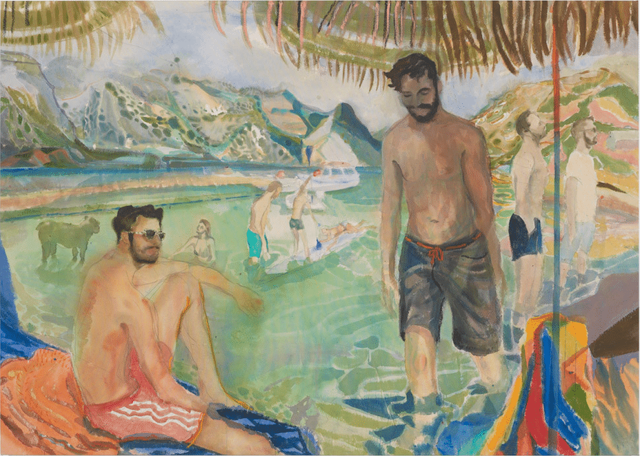
Antonia’s paintings have the power to evoke a deep nostalgia of events you’ve never experienced, places you’ve never been and people you’ve never met. Combining a palette of golden yellows, rich reds and fertile greens with subdued, delicate brush strokes to capture the very essence of fleeting memories. Landscapes that stretch far beyond the confines of the canvas are populated by vague, often ghost-like figures repeating and reinacting the artist’s recollections.

Antonia will feature in ‘Out Of This World’ a group exhibition at Stephen Friedman Galleryin London showcasing female figurative artists, which opens February 7th.


Website/Instagram


To read more from Hector Campbell, see his Top Five from Condo 2019


Fluidity of Shape: A Conversation Between Benjamin Murphy and Igor Moritz

Fluidity of Shape – A conversation between Benjamin Murphy and Igor Moritz

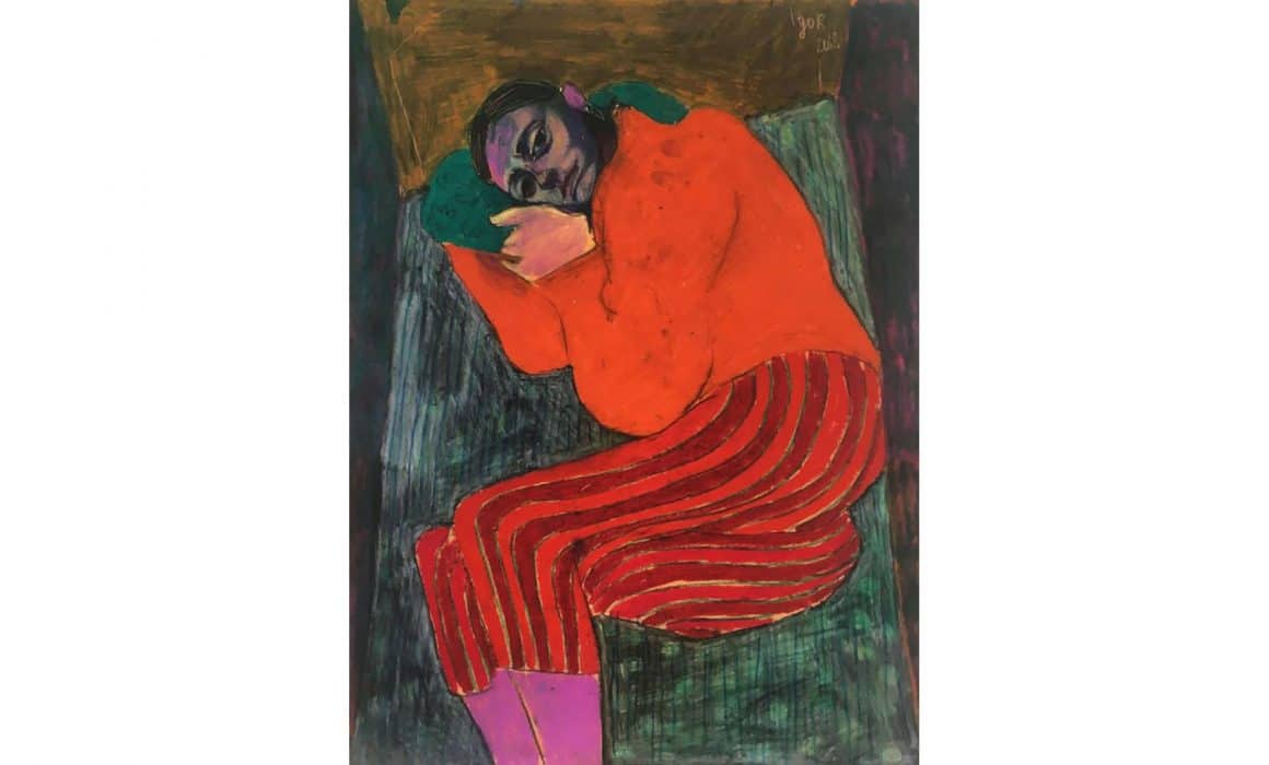
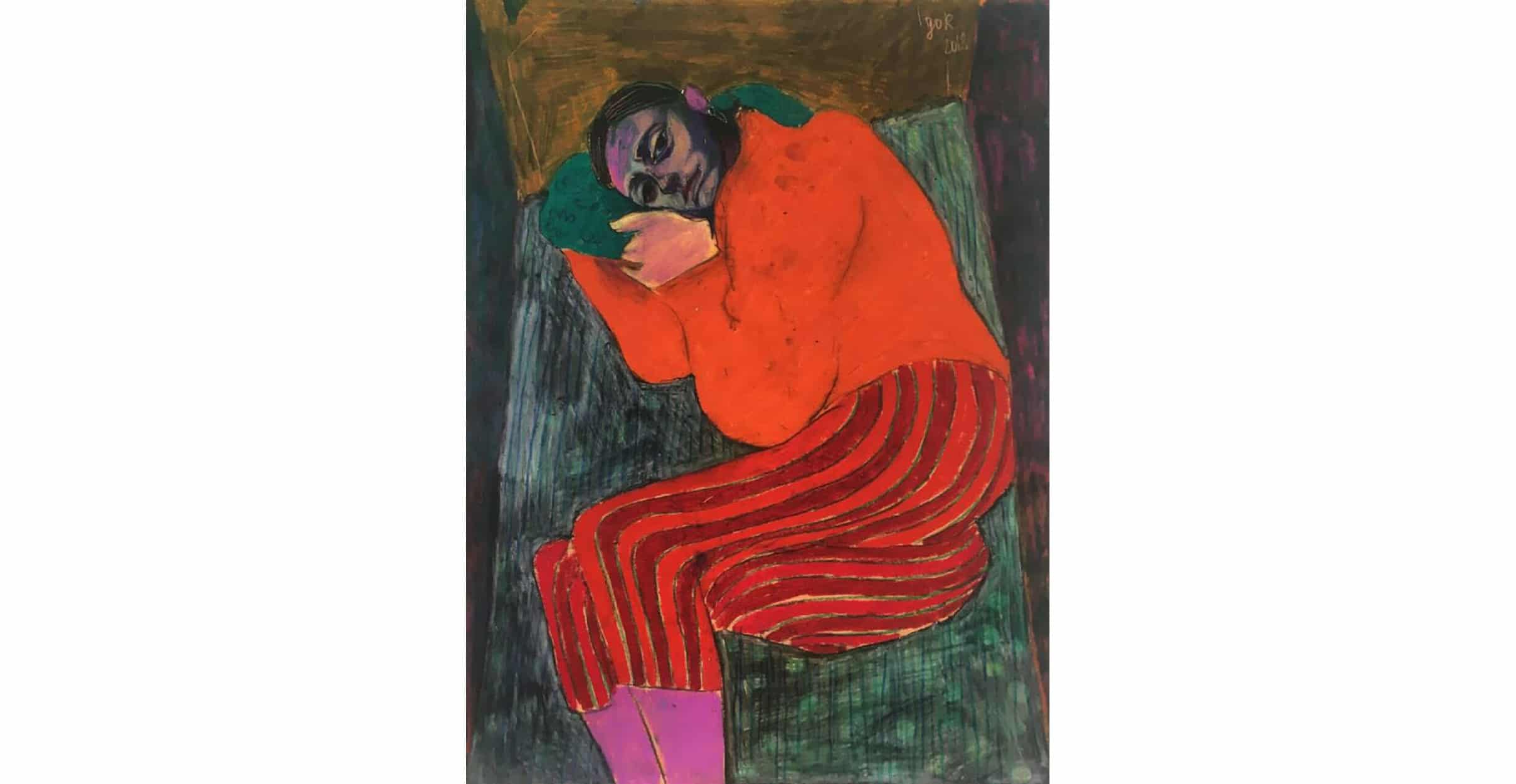
Igor Moritz is an incredibly exciting young artist whom I discovered through our mutual friend Andrew Salgado. His approach to painting the human form speaks of expressionism – with the distorted and contorted form, with the awkward perspectives – painted expertly. His paintings are reminiscent of both Egon Schiele and Henri Matisse, whilst being entirely and refreshingly unique. For such a young artist, he has developed a signature style that most would be envious of. His output is incredibly consistent, whether working in coloured pencil on his specially-prepared paper, or with the more traditional use of oil paint and canvas.

Fluidity of shape - delphian gallery

October by Igor Moritz

BM – Firstly – Why are you an artist?

IM – I think over the last couple of years, looking has crossed over from something that’s passive into something that’s very active in my life. I’ve become absolutely obsessed with everything from colour combinations, facial expressions, to the perception of space and fluidity of shape. Since I have started taking so many things in, I have the necessity to let some of it out too.

BM – So is your feeling of necessity a compulsion? From my own experience, the creative act is almost like a drug I need to stay sane, and I get very frustrated if I can’t work for an extended period of time.

IM – Oh yes, definitely. You can say it’s a compulsion, where the obsession would be the looking. I get extremely fidgety and overwhelmed by everything if I haven’t been painting for a day or so.

BM – Going back to your use of space and shape, where do the distortions of and experiments with these come from? Do you see those things as they appear in your work, or do you intentionally distort them, and if so, for what purpose?

IM – I aim for realism in my work. What I mean by that is, that there is no way to portray any three-dimensional thing on a two-dimensional plane with no distortion. All things have an infinite amount of looks attached to them, and I try to grasp a bit of that essence. I will go about doing that to my advantage, by morphing it the right way to contribute to formal aspects of the work. I have noticed a fundamental change in how I see things, maybe it’s my growing astigmatism or a perception disorder.

BM – Your use of colour is also interesting, it’s as if Francis Bacon had a child with Henri Matisse, and that child grew up to be Igor Moritz. Who are your biggest influences and how do those influences trickle down into your work?

IM – Colour is another phenomenon that is an obsession of mine, and a big driving force in my work. The two you mentioned above know how to use it brilliantly, and are two of the big loves of my life. In terms of colour I’m humbled by Kandinsky’s work from the late 1930s – he seemed to have figured it out. Other artists I look up to would include people like Kirchner, Tal R, Freud, Degas and portraits from the Polish master Witkacy.

BM – So lets talk a bit about the technicality of your works. You are unquestionably a brilliant draftsman but your drawing technique is quite unusual. Tell me about the way you soak paper in linseed oil and how this alters the work.

IM – I don’t know if I can be credited with the invention of that technique but I haven’t seen it used by anyone else. What I do is soak the back of the paper in linseed oil, so that the paper has a sort-of self-lubricating feel to it. When drawing on it with coloured pencils the crushed pigment seems to connect with oil and create an opaque and vibrant finish. What is unusual is that the drawings dry like paintings would, so they do not smudge when done.

BM – Would you say your practice is dependent on experimentation in general?

IM – I just don’t want things to go stale. So I constantly try to find new and better ways of doing what I do.

BM – How have your design-based studies influenced your painting?

IM – It has definitely provided me with a greater insight and respect for objects. It has made me understand the dead things that have a lot of soul and an emotional presence too.

BM – Dead things in what sense?

IM – Sorry I got that from the Polish – in Polish a still life is called Dead Nature. I meant objects, so things like chairs, cups, tables, and scissors etc.

BM – Oh, I like it. So do you approach a ‘dead thing’ any differently to how you approach painting the living?

IM – Not anymore, I hope to be able to paint a chair with as much emotion as someone I love.

To view more of Igor’s work, please click THIS LINK

To purchase prints, please click THIS LINK


Originally published in This Is Tomorrow


Remi Rough in conversation with Dr. Charley Peters

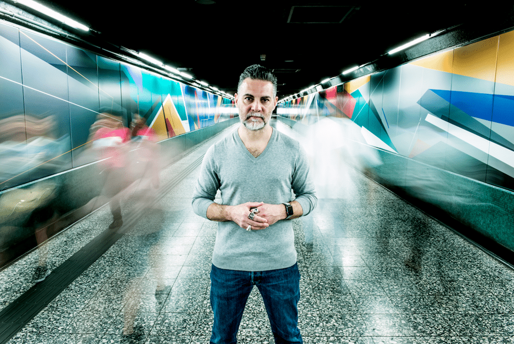
Remi Rough (b. 1971, London, UK) began making paintings on walls and trains in South London in the 1980s. A respected train writer, Remi has maintained a dynamic presence on the street while developing a prolific profile as a studio painter, recently showing at MOCA (London), Wunderkammen Gallery (Rome), Zimmerling & Jungfleisch (Saarbrucken) and ArtScience Museum (Singapore).

I spoke to the artist about the formal concerns of his work, his relationship with definitions of his practice, and the legacy of abstraction in the ongoing evolution of his paintings.

remi rough portrait

Installation at Quarry Bay Station, Hong Kong for MTRHK and Swire Properties.
Hong Kong 2018.

[Charley Peters] How do you feel at this point in your career about definitions of your work as ‘graffiti art’? Could you say something about the relationship between your work on the street and the paintings you make in the studio, presumably they may have different audiences or you might apply a shift in logic in your approaches to both practices? 
[Remi Rough] I can totally live with the word ‘graffiti’, it’s other terms I’m a lot less comfortable with. I often use the term ‘post graffiti’ as I think it best describes where I am personally with the kind of work that I make now.
I don’t consciously make any shift in logic between my studio work and work in public spaces, to me the same rules apply. If i’m honest the work outside is a lot easier because you can hide behind your mistakes due to the scale you’re working to. The studio work if anything is a more refined version of the works I do publicly.
[CP] Are there any terms that you feel comfortable with in terms of how you would define yourself as an artist? 
[RR] I really think that what I do sits in-between so many brackets it’s actually quite hard to pinpoint what genre (if any), it is. Contemporary is fine for me, as I mentioned before ‘post graffiti’ as an adjective to the work is fine also. I used to use the term painter but even that has less importance to me now. I have ideas way beyond just paint on surface.
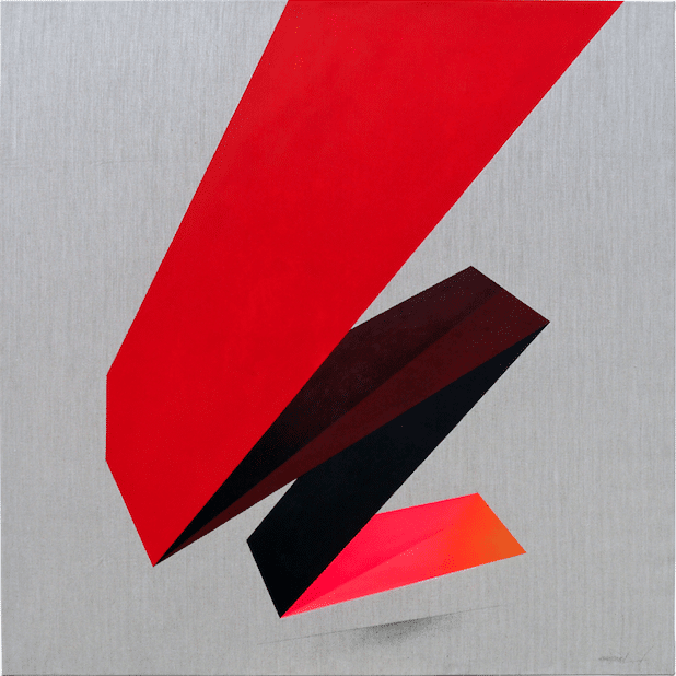
remi rough canvas

The Absolute _ 2017
Graphite, acrylic and spray paint on herringbone linen
120 x 120cm

[CP] How would you describe your working process?
[RR] Mathematical… I don’t think people really know just how much mathematics goes into the work I create. Without maths I’d be completely lost. I use geometry to plan the paintings I make and from there I start to build the images up from simple graphite lines to taped, primed sections to final colour forms. It’s a slow process with tape and paint as drying times are essential to every layer.
[CP] You engage actively in processes of collaboration with other artists. In some ways this is at odds with our conventional definitions of a studio artist – could you talk through your approach to collaboration and how it enhances or supplements the work you make as an individual artist?
[RR] As young graffiti writers we collaborated constantly. You have to remember that graffiti is the only art form ever created by and taken forward by children and with that there are less oppressive egos and much more openness to working together. We don’t have the foibles of most adult artists about working together and sharing what we do. Nowadays I like the challenge of working alongside and with other artists. I think about the end results and the process in equal terms. I get a lot from this process. For example one artist I have done a lot of work with over the past few years is NAWER from Poland. As well as being a fantastic artist and amazing designer he’s a good friend and we’ve both learnt loads from each other. Working out how to make our styles of work sit comfortably together in a space and not vie for attention against each other is a big challenge but we seem to have found a great way of working. I am not precious about my work when I’m collaborating, I think big decisions about the people you work with are very important too.
[CP] You use a very particular colour palette, how important is colour to you and how do you make decisions about its presence in your painting?
[RR] A think a lot of the colour decisions happen during the drawing process. I tend to make notes on particular palettes and see what works for what painting. Weirdly the paintings I make are often not wholly pre-meditated. A lot happens as it happens so to speak.
That said I tend to change colours quite a lot during making work too. I seem to have a strong sense of what is needed and when. I think if graffiti has taught me one thing it’s knowing when to stop.
[CP] You make many art historical references in your painting – alluding to movements including Suprematism, Constructivism and Neo-Plasticism. I find this interesting as much work that is derived from a practice on the street fails to look beyond or be defined outside of popular culture as a frame of reference. How do these modernist references provide a context for your own painting? How does your work challenge or develop what art history has shown us?
[RR] Graffiti as an art form is one of the last true abstract movements. We took letters, we distorted them and abstracted them way beyond their original form. There were no boundaries, rules or limitations. I was always looking beyond populist references whether it was Dali or Mondrian or later when I started educating myself about history of art and understanding the limitless options of where I could take my work. As I have never been formally educated in art I have always taken it upon myself to fill my mind with knowledge both academic and visual. Hence the discovery of De Stijl, Constructivism, Vorticism, Bauhas and beyond. The context for me lies in the beginnings of all these movements. I was part of the inception of a similar important and historical movement. My life and the lives of Malevich, Van Doesburg or the suprematists are intertwined. I needed to find a voice within my work, I needed to find a structure and as the letter gradually fell away, the words that I painted become the architecture that surrounds us or the magazines we read or the interiors we live in. It’s all part of our cultural fabric and seemingly more evident now then ever before as we don’t have to fight oppressive governments to be heard or seen and don’t have to hide what we do because it’s deemed inappropriate. It’s still coded language much like graffiti writing but it’s easier to translate now.
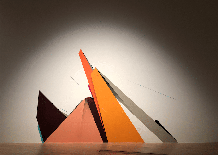
remi rough wall painting

Concise
Part of the ‘Art from the streets’ exhibition at the Art Science Museum, Singapore
Singapore 2018.

[CP] At times it feels that you are appropriating modernist aesthetics, such as your works based on Malevich’s Black Square, which appear as a mashup of original referent and your own concerns with making paintings. I’m intrigued by this as a contemporary – or at least familiarly postmodern – form of authorship. Is there any direct relationship between this strategy of visual ‘sampling’ and the work you do with music?  
[RR] It’s all remixing. Malevich didn’t invent the ‘black square’ he simply found a channel for it. Everything we do is a remix to a certain degree. Every word we speak has been uttered trillions of times already. Every image exists in some way shape or form already, it’s how you choose to re-imagine it that makes for interesting art. As much as I love a lot of that early suprematist work I think a lot of it wasn’t quite where it should be in terms of composition or finish. We can look at those origins now and inform new work with similarly imbued aesthetics and tweak the compositions and the finishes and add something that just wasn’t possible in the early 20th Century.
[CP] I was wondering, given your interest in formalism, how important is the presence of the ‘image’ in your work?
[RR] The image is everything and nothing. I guess it isn’t that important to me but once work becomes known as a style or an aesthetic does it not become an image by default? 
My main concern with painting is to push the boundaries of this as far as possible but still retain some kind of stylistic approach. To never make the same painting twice but for the viewer to know exactly what and who they are looking at I guess.
For more work by Remi Rough, visit his website HERE
And for more by Charley Peters, visit her website HERE
Remi Rough and Charley Peters are both exhibiting as part of the three-way collaborative show Interlude at The House Of Saint Barnabus alongside Peter Lamb – on until the end of March.
For more guest articles, check out Rowan Newton interviewing Robin Footitt HERE

Lucas Price – Body Body

Lucas Price is currently exhibiting as part of the inaugural Bangkok Art Bienalle until Feb 2019, with the video work Body Body. 
We decided to catch up with him and discuss the emotive, and brutally honest work.
Lucas Price - Body Body

Lucas Price – Body Body

Can you please explain a little about what the video is about, and how you came to make it?
The video is a long series of screen tests of people who at the time of recording were immigrants in Thailand. I was recovering from a stay at a temple, where I had gone to detox from heroin. I felt that my body was under attack, from itself in a way, had been colonised by this thing. So I was thinking about that and the various ways people’s bodies are prone to pressure. I began by recording my drug dealer, then moved outward and began to record his friends, their peers, tourists, diplomats etc. I wanted to make something about my relationship to Bangkok, and it ended up being about being an outsider. So, it’s about that and moving through the world and how the body is coming and going in amongst all of this.
Body Body is obviously an incredibly personal project for you, how have you reconciled making the private public, and how did you decide what to include and what to omit?
I really feel that its a universal set of principles I’m trying to sort out. Like we all have to abide inside of our bodies. And we’re all trying to keep the show on the road. There are personal references, but I think it’s worth being honest if it means that somehow it allows for more of the same? That’s certainly my experience. Other people’s honesty makes room for my own. I don’t know if this works in the same way but it’s partly the intention.
Who are the people in the video, and how much has been explained to them about the project before filming?
The people in the film were…everyone was street cast. I made a studio in the back of a truck which I drove around Bangkok for a week. We went to slums on the outskirts, the hi so areas, the red light district, chinatown. Suburbs, tourist traps, immigration centres. Everyone was made aware that the film was a simple series of portraits, to be screened in a gallery. It was very ad-hoc but everyone was made aware of the nature of the project and I had consent throughout. The most interesting and eager to participate were the african sex workers, who at the time were under an enormous amount of pressure as the result of a crackdown by the Thai police called operation Black Eagle. They were rounded up every couple of nights and extorted or intimidated, squeezed for cash and then ultimately deported or sent to immigration centres on the way to being deported. I think they were the limit expression of that idea of being placed under extreme amounts of pressure.
There are a lot of mentions of the sea and drowning – both in a sinister, foreboding way, but also in a cleansing and regenerating way. What is the significance of water within this particular piece?
The sea…idk, it’s just a good place to be. A large body. It unified a lot of the experiences I have of travelling and being dislocated. It’s also…I was thinking about this idea of experience and awareness, of waves being parts of a whole thing..the wave is not the ocean, the ocean contains all the waves. Also shout out to The Waves by Virginia Woolf.
Do you see this work as being redemptive in any way, or is it a cathartic experience revealing such personal details?
I think the details aren’t so important as maybe trying to be honest and even earnest? I mean I’m cynical, and I don’t know whether the film is successful in any meaningful way…at least in the way I originally intended, but if I think about what is at stake, for me it’s certainly about being honest…like congruous or something.

It’s not about redemption, as much as making sense post meltdown. And whatever works in those conditions right? I’ve chastised myself for including my own stuff in my work in the past but…it’s like Nan Goldin or Brad Phillips. I like that honesty, it’s healing.


Check out his Instagram HERE


(Interview by Benjamin Murphy)

FOR MORE INTERVIEWS, CHECK OUT:

JORDY KERWICK

HAYDEN KAYS

KLAUS BUSCH RISVIG


Tracey Emin – A Fortnight Of Tears

Tracey Emin – A Fortnight Of Tears

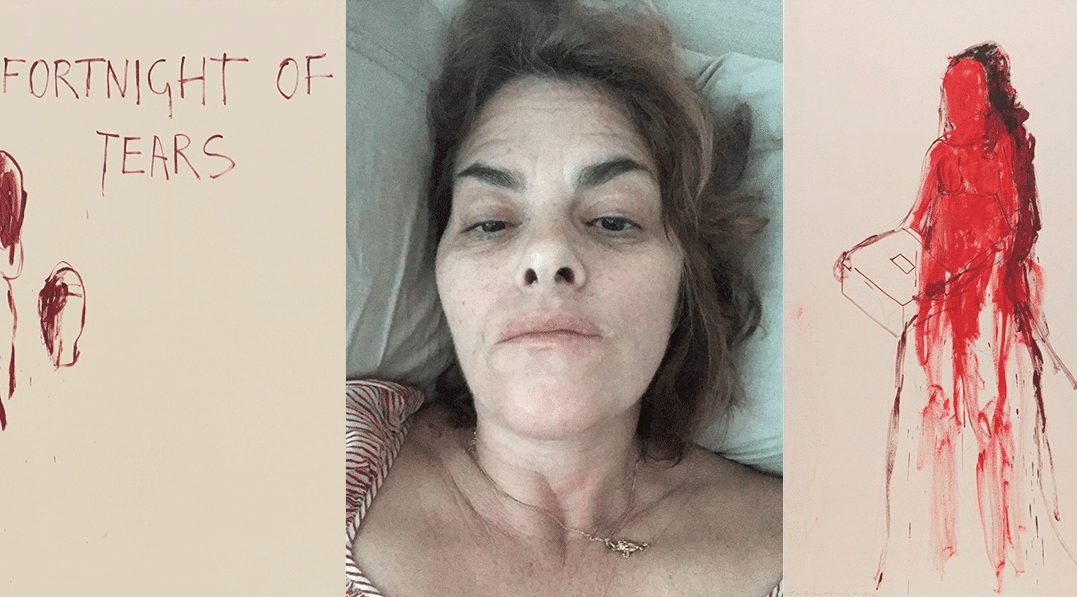
Chronicling the most recent developments in Tracey Emin’s practice, ‘A Fortnight of Tears’ opens at White Cube Bermondsey in February 2019.

This major exhibition spans the entire gallery and brings together new painting, photography, large-scale sculpture, film and neon text, all stemming from the artist’s deeply personal memories and emotions ranging from loss, grief, longing and spiritual love.

Three monumental, bronze sculptural figures, the largest Emin has produced to date, are shown alongside her lyrical and expressive paintings. Developed through a process of drawing, the paintings are then intensely reworked and added to, layer upon layer.

Tracey Emin - A Fortnight Of Tears

Tracey Emin – A Fortnight Of Tears

White Cube also debuts a new photographic series by Emin titled ‘Insomnia’. Selected from thousands of self-portraits taken by the artist on her iPhone over the last couple of years, these images spontaneously capture prolonged periods of restlessness and inner turmoil.

Filmmaking has been an integral part of Emin’s career for over 20 years. To mark this, the artist will show a new film as well as the key early work How It Feels (1996), a candid and moving account of her abortions that changed her whole approach to making art.


For more great art exhibitions on right now, see this review of Chris Burden at Gagosian by Benjamin Murphy HERE

For more about Tracey Emin, see the White Cube website HERE


Guest Column – Nicholas Burns

Inside the Bug Jar By Nicholas Burns

Nicholas Burns

I
In a jar full of bugs,
I am agitated. On display
My actions and motives are questioned by
Leering eyes.
Waiting for the chance to dissect me and use me.
Abuse me and isolate my weaknesses
I must be deft and dexterous
Flexible and malleable
Able to adapt and function in all environments
My design must be flawless and innovative
Cohesive, yet groundbreaking

Eliminate the excess.
Don’t be the freak.

Tweak it.
Perfect it.
Make it the best.

Because no one remembers those who live in mediocrity.
The worker bees serve an elegant purpose.
Committed to one another as
A unit.
A family
Aiming to produce the best. The sweetest.

Don’t make a mistake because you must remember

Everyone is watching

II
In a room full of mirrors,
I see a thousand mistakes.
Changes I need to make
We need to make

I’ve said too much
I’ve seen too much
Yet not enough
Still looking for myself
In a world of constant change and
Scrutiny,
Controversy,
And Competition
I am under the microscope

I’m reinventing myself
I’ll dye my hair
Blue and orange, green and gray
Then black
I’m every color
Then no color at all

I’m reinventing myself
I’ll dress the best
Maintain a look of confidence
Even though I’m frightened and ashamed
I’ll spritz that dark rum scent
Scent like sex
Yet my airs produce miasmic odors
An attractor and repellent

What do I need to do to see this through?
I want to fix the world but I can’t seem to fix myself

I need a shortcut
A pointer
A guide

If only these mirrors could talk

III
In a puzzle with infinite pieces
I am in need of fresh air
But at least I’m finding grounding
In the lack of control

What started a storm with no foreseeable end
I am now in its eye
I am calm
The storm still persists, still rages
But I have a damn good umbrella

Like the bees, I’m still at work
Still dressed the best
I spritz my chest
To keep the lingering smell
That became my attractor

Yet now I discard this idea of supremacy
Perfection, a silly structure
A hierarchical mirage
I prefer to be the freak
To take my position in left field

I want to build something beautiful
But I sometimes forget the recipe
I am the baker and the chef,
But deft I am not

I’m making a mess, and it’s getting everywhere
And that’s fine with me
Food fights are fun
Spontaneous
Collaborative
Colorful

Perfection is a mirage
And in the desert of opportunities
I’ll save my energy for fruitful excursions
That mirage will always disappear

And that’s fine with me.


Studio Art Alumni:
Inside the Bug Jar
Jan 22 – Feb 22, 2019
Artist Reception: Feb 7, 4-7pm


Nicholas Burns – WEBSITE


For more guest columns, check out Andrew Salgado’s essay about the work of Benjamin Murphy HERE