Articles Tagged with: abstraction

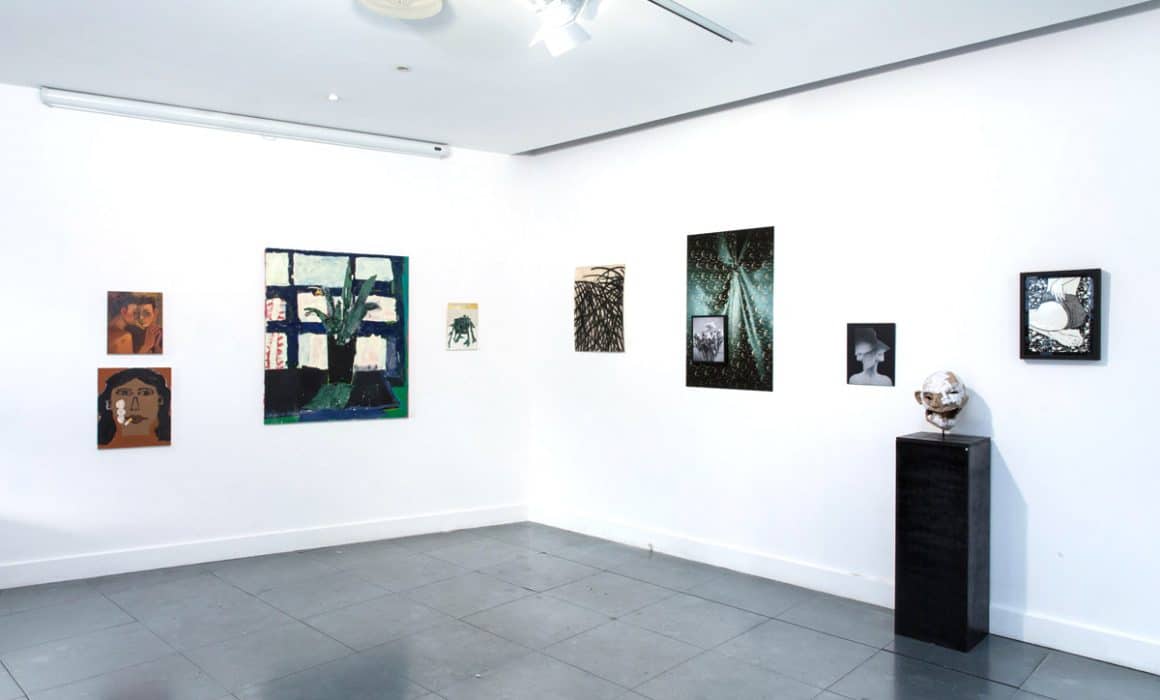
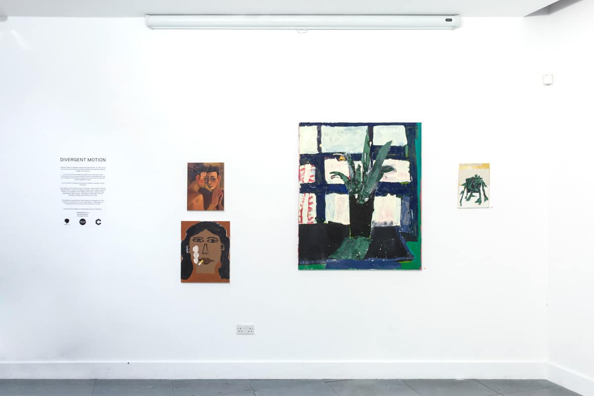
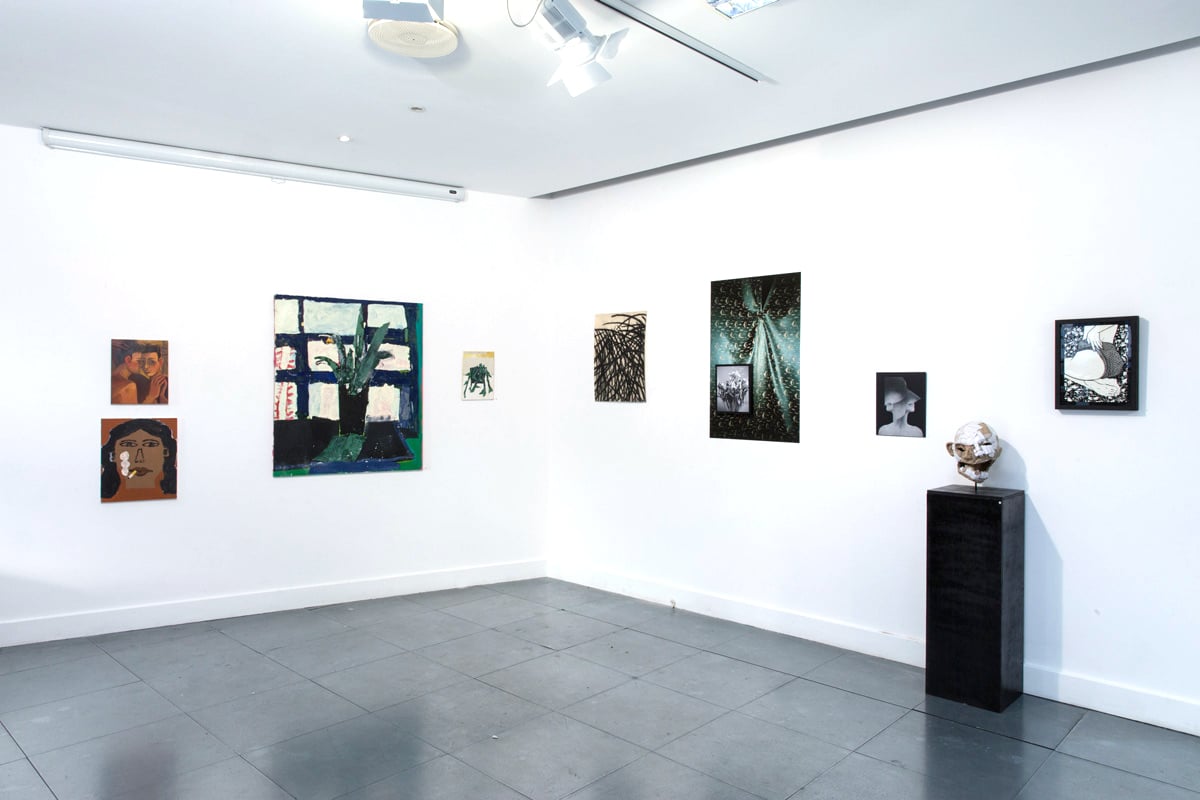
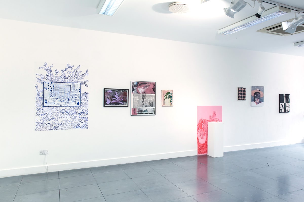
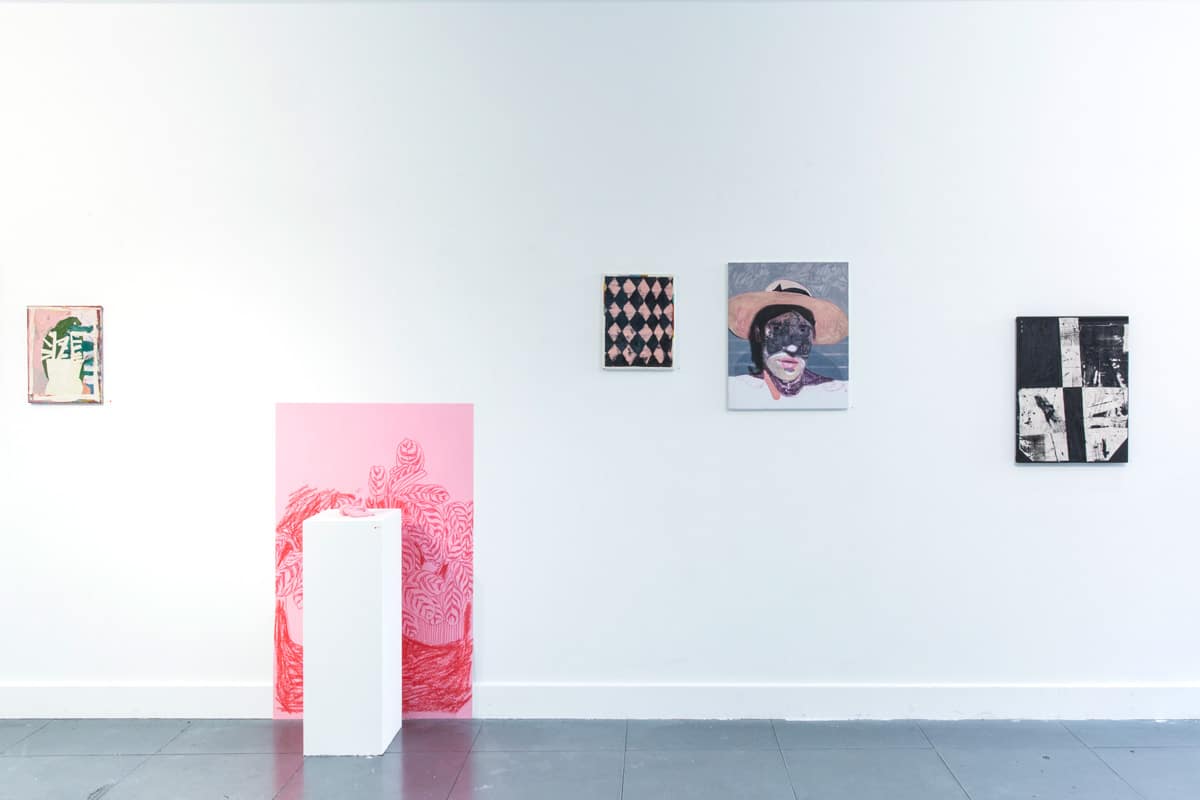
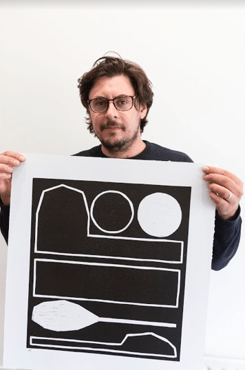
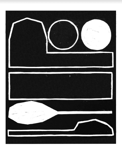
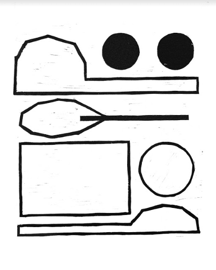
Trying not to Breathe – Benjamin Murphy and Taylor A White

Trying not to Breathe – A Conversation between Artists Benjamin Murphy and Taylor A White

Taylor White is an artist who’s paintings are a visual record of his violently-unique character. Sitting somewhere in between gestural abstraction and hard-edged formalism (with the odd bit of representation), his works are an overload of perfectly-ordered chaos. His online persona feeds into this entropic aura that surrounds his works, and it is impossible not to see the joy he has both in his work and life. I decided to have a little chat with him about his work, because scrolling through his Instagram was such an entertaining, and inspiring experience, that I couldn’t help but try to find out more.

The statement that he has about his work on his website is a perfect example of what I have tried to elucidate above, and for this reason I have decided to include it verbatim.

My work gives form to fleeting memories and the dormant mania crawling beneath the carpet of the western home. These images recount crisis and triumph, momentum and confinement, lust and low-altitude bombing. Finding stillness in the recording of arguments within the process of painting and drawing, I return to my childhood freezer filled with popsicles and secret passageways.
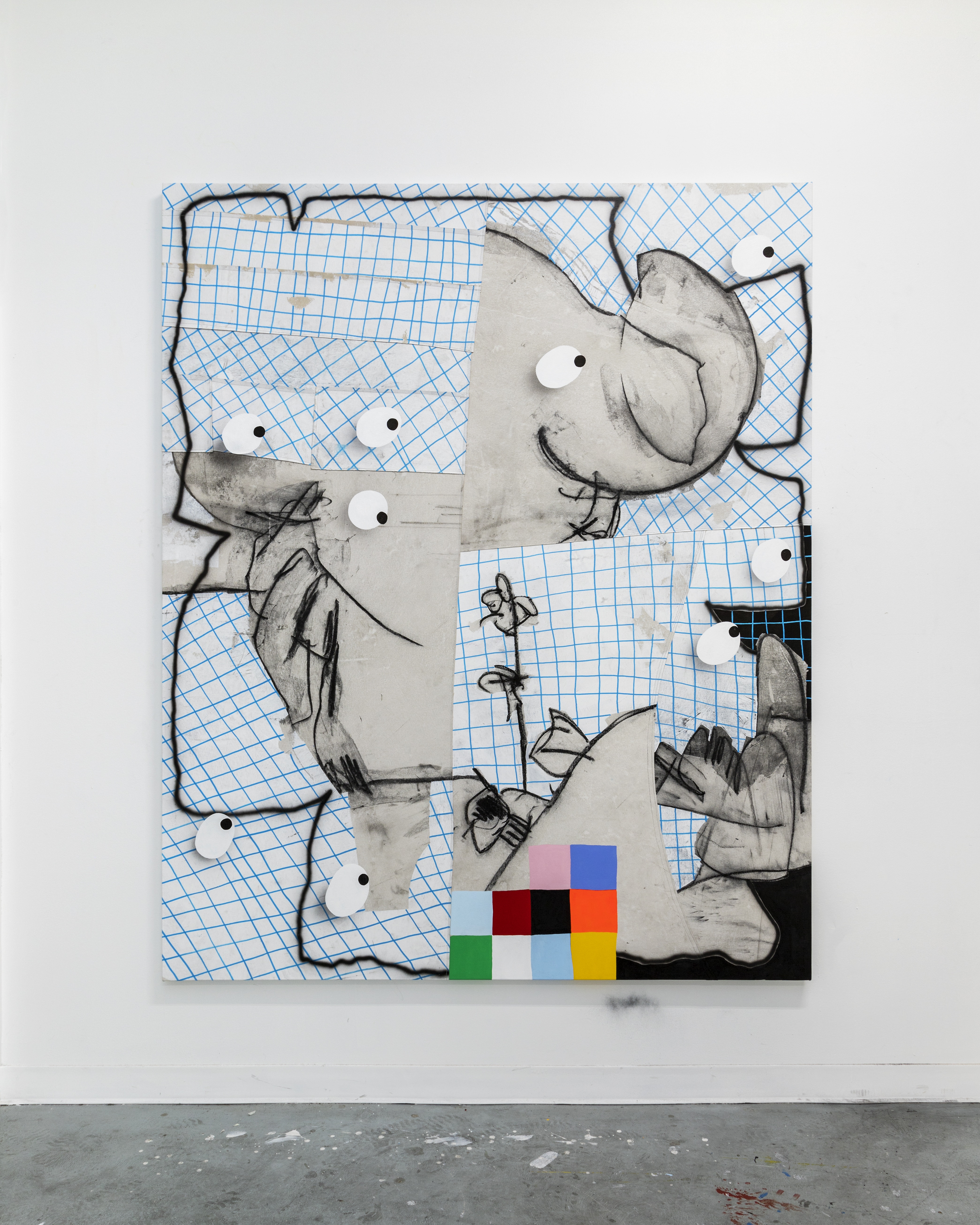
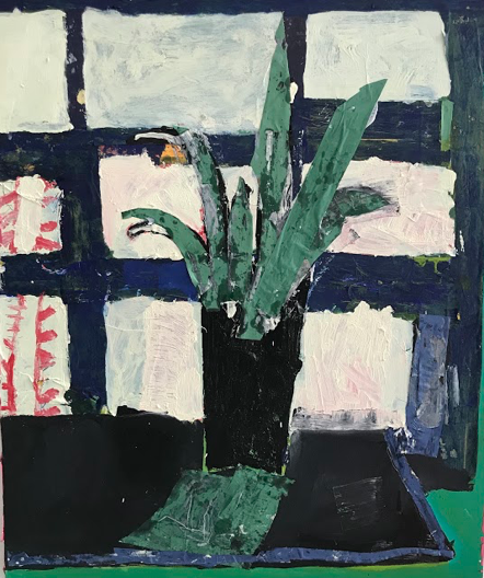
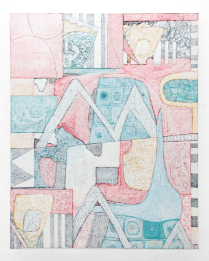
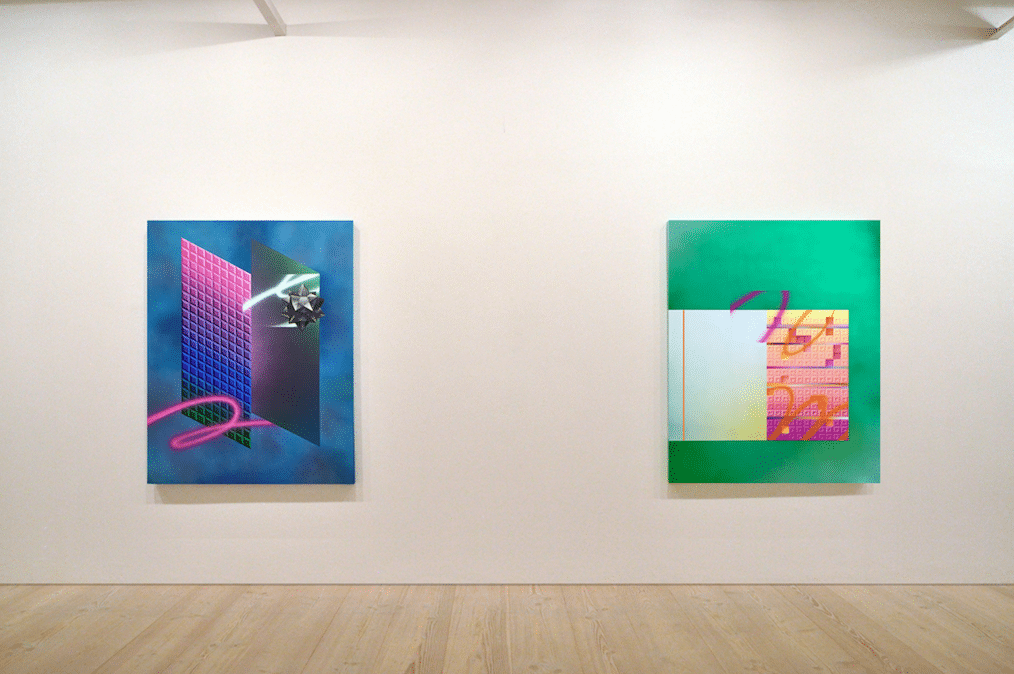
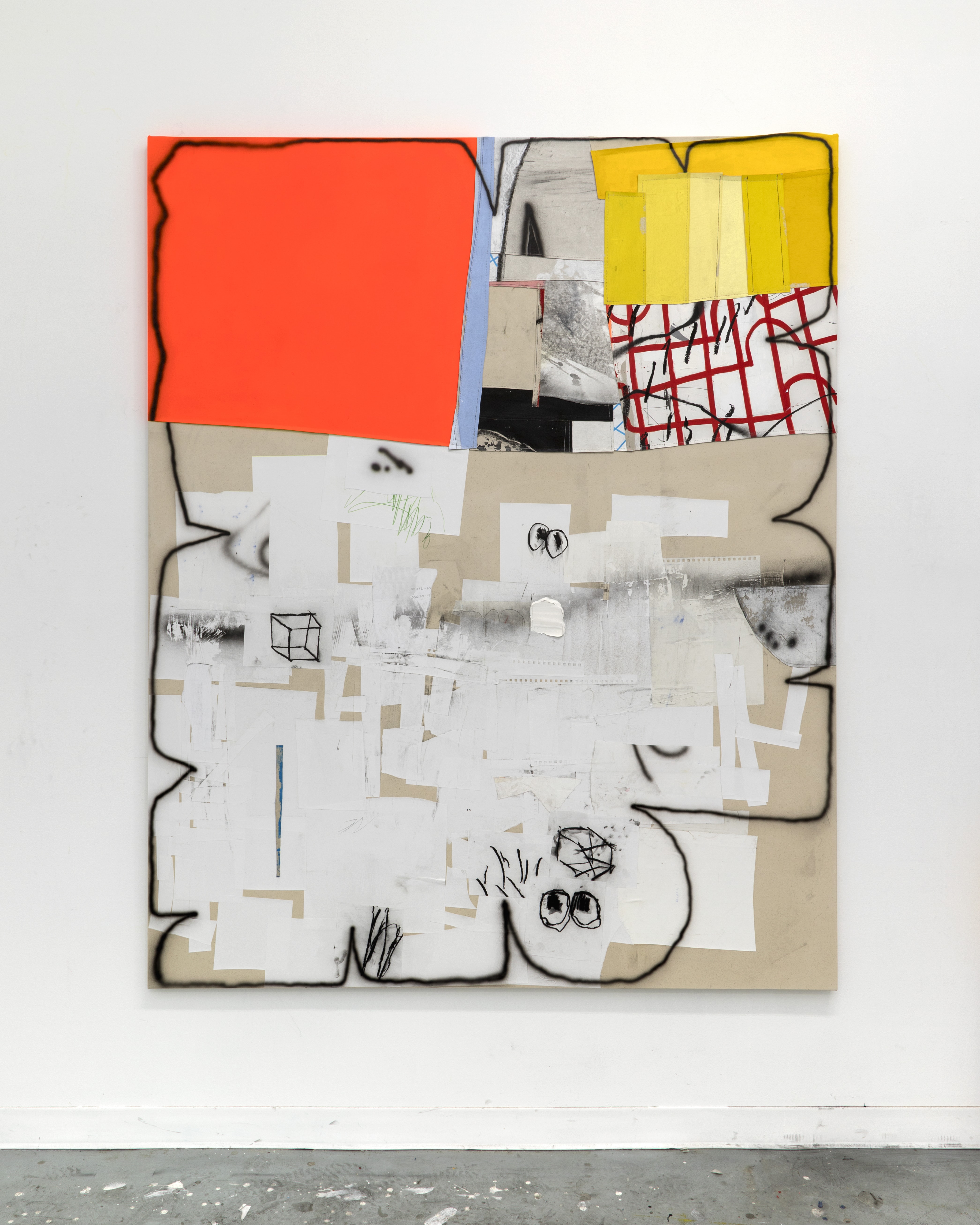
Taylor a white

Fake Zoo

Benjamin Murphy – Firstly, why are you an artist? Taylor A White – I don’t think I could enjoy my life if I wasn’t making art on a near constant basis. It’s something I seriously have to do to be able to sleep at night. I didn’t get really serious with it until I was 35 (I’m 40 now) and it totally took over my life. It was something that I returned to after spending my 20’s in the military, and it sort of transported me to a place I remember from my childhood. Making art kind of re-wired me after the military, and it seriously changed my worldview and how I viewed myself. BM – Was it that you felt like you needed rewiring post-military service, and it was art that did that job, or was the rewiring an unexpected thing that happened because you’d started painting? TAW – The shift in my thinking (or re-wiring) really happened unexpectedly. I started going to college for Psychology (mainly because I didn’t know what to go to college for, and it sounded responsible, lol) and I eventually took an elective art class which was the intro class you had to take before you could take the other classes. I was immediately hooked, as soon as I smelled the inside of the art department, I knew I’d found the place I was supposed to be. BM – Wow. I actually went to art school because I didn’t know what else to do, so it’s funny that you came to the same destination from the opposite direction.  So do you think that painting is something you could have very easily not discovered? TAW – Oh definitely. I actually almost quit the first painting class because I became so annoyed with my inability to do basic things painting things like creating a gradation between two colors. I was frustrated that it did not have the directness and speed of drawing, I was just pushing this hard to control goop around and it wasn’t satisfying. I had a great painting professor that really encouraged me to just draw with paint, and stop thinking about painting in such a rigid conventional way.
taylor a white

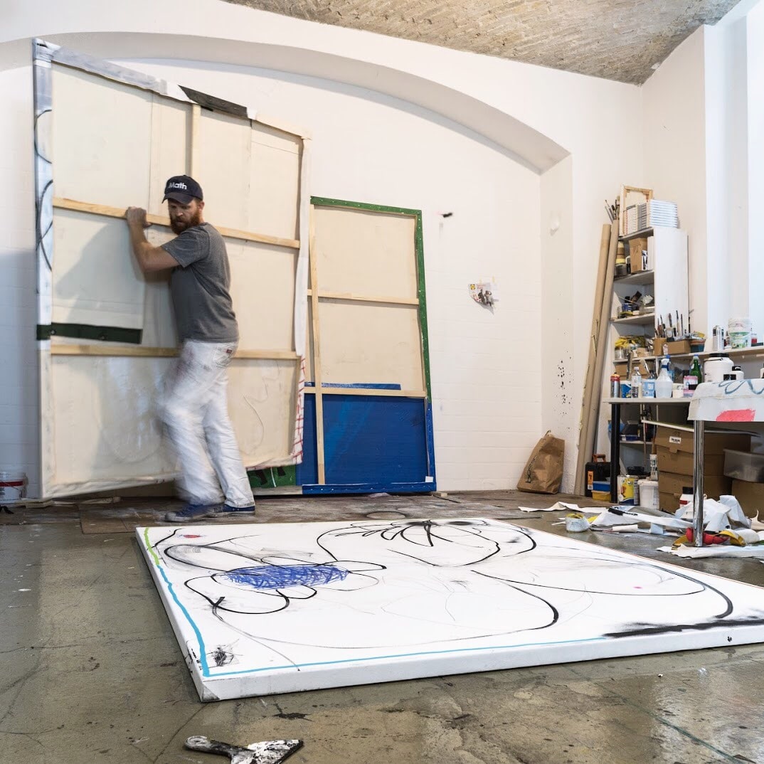
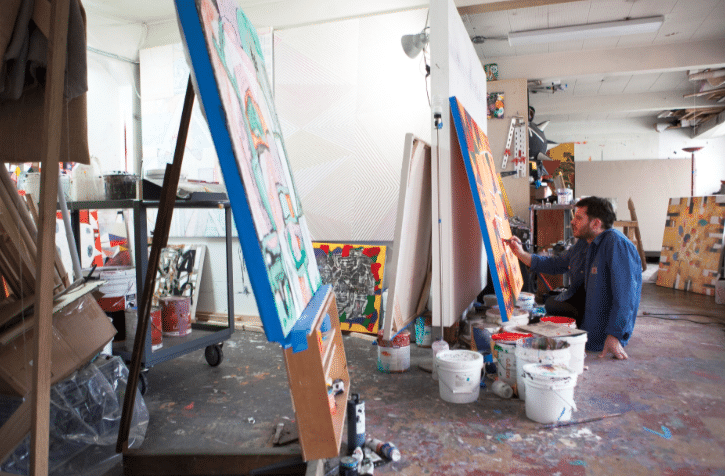
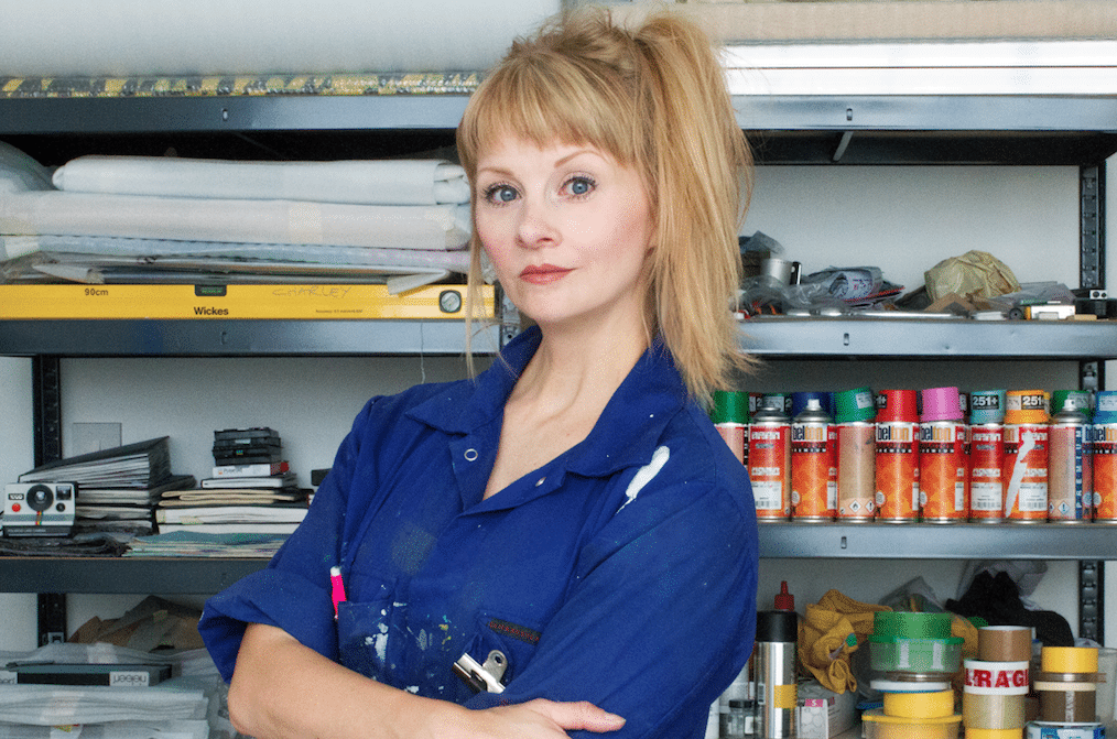
Taylor A White in his studio

BM – Do you think you could still quit now, or has painting become a part of who you are? TAW – Hahahaha no I could never quit, it would be like trying not to breathe. BM – That’s interesting, as you almost never found it. TAW – That’s true. I kinda stumbled into it and it immediately transported me back to my childhood. BM – Do you think you needed that? TAW – No, I didn’t realize I needed it at first, it kinda snuck up on me. Taylor A White BM – What is your work about? TAW – I don’t ever intentionally make work about a specific subject, or try to direct viewers to see it in a certain way. Often I can overhear a segment of a conversation or something like that, and it sort of becomes a point of departure in a painting. I’m always interested in letting the work completely become unhinged from that initial prompt, and I never feel any obligation to circle back and force it to make sense, to resolve it BM – So how does it make you feel when you look at it afterwards, and are there any signifiers within the work that you can identify as being related to certain things? TAW – I generally don’t let a painting survive if it makes sense, I find it boring. Sometimes symbols and shapes that I draw are interpreted as specific signifiers for something, but they’re most often based on my immediate interest in drawing them. Sometimes that can result in something that maybe points to things happening in the subconscious l, but I’m comfortable with letting people interpret it however they’d like. I also had a great teacher that once told me “you’re saying more than you might think”. So I just kept going, firing from instinct and impulse.
Taylor A White

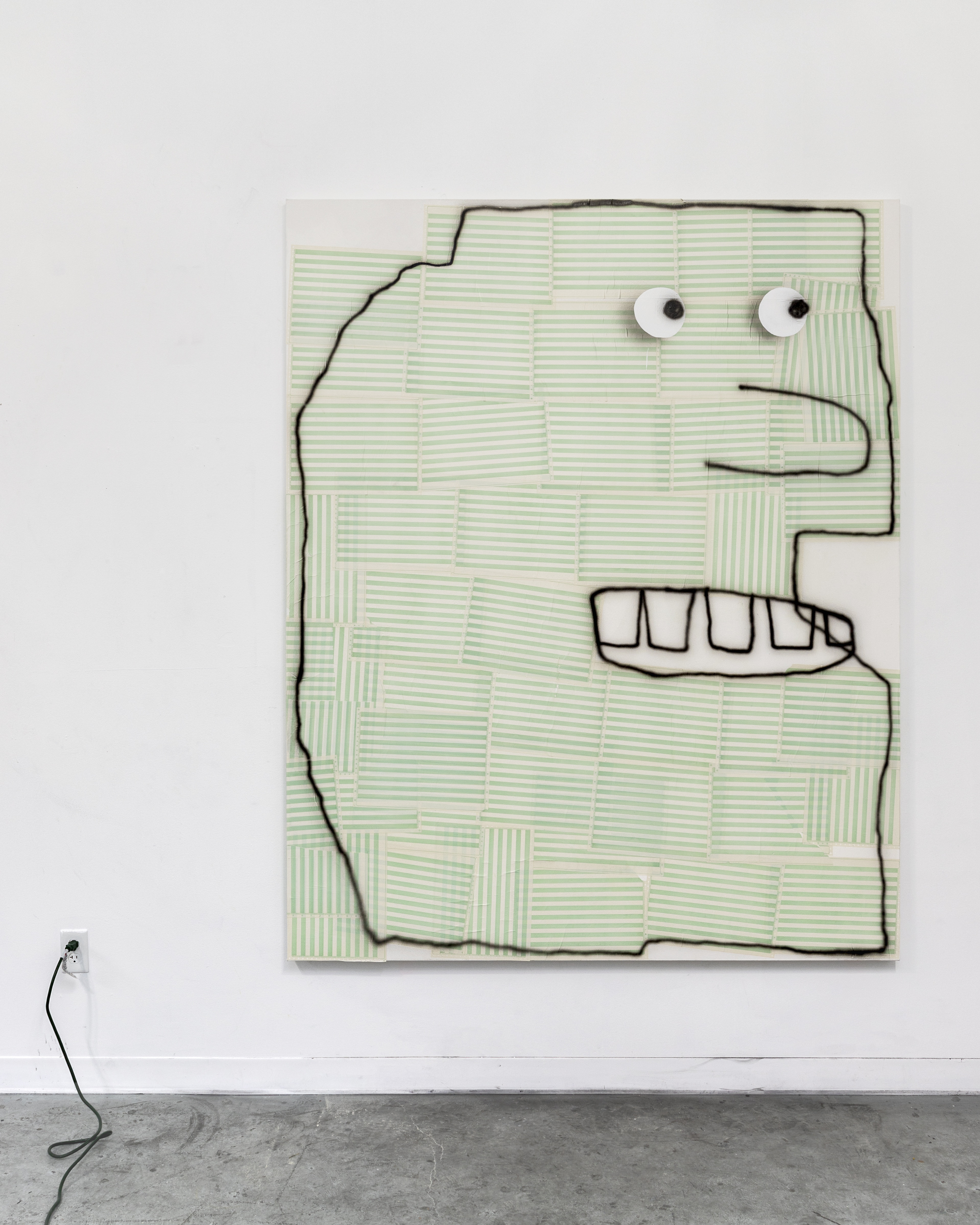
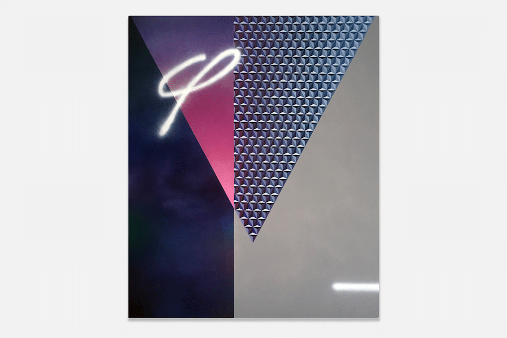
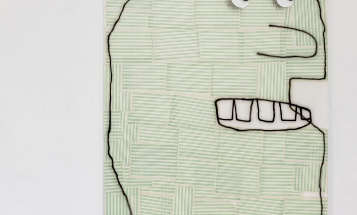
Maybe We Should be Kissing

BM – In general, do you think that the most successful artworks are those that are least didactic? JFK once said something along the lines of “Art is not propaganda, art is truth”, and I think it’s really apt. TAW – I’d say I agree with that. I’m definitely most interested in art that I immediately find confusing. BM – If you had unlimited time, money, space, what would be your dream project? TAW – Hmm, ok here’s one thing I’d do immediately: I’d like to tie or affix Matthew McConaughey to objects and only allow him to repeatedly say “Alright, alright, alright”. Like just imagine him doing that, placed sideways at the bottom of a huge painting. I love it. BM – Haha that is wild. I’m going to end this interview there, because there can be no better way to wrap one of these things up than with that image. So thank you. TAW – Thank you.
Taylor A White

It’s Like You Don’t Even Care About Vitamins

For more interviews For more conversations Michael Swaney Richie Culver

Divergent Motion Install

Divergent motion install

Jake Grewal, Cannon Dill, and Florence Hutchings

L-R: Jake Grewal, Cannon Dill, Florence Hutchings, Paul Weiner, Nick JS Thompson, Jesse Draxler, Jerry Kowalsky, Benjamin Murphy

divergent motion install

L-R: Mike Ballard, Claire Johnson, Galina Munroe, Cathy Tabbakh

divergent motion install

L-R: Beth Rodway, Rusudan Khizanishvili, Mike Ballard, Florence Hutchings, Klaus Is Koming, Francisco Mendes Moreira, Lou Ros, Tess Williams

Divergent Motion install

Florence Hutchings, Klaus Is Koming, Francisco Mendes Moreira, Lou Ros, Tess Williams


For the catalogue of works, please email Info@delphiangallery.com


Divergent Motion – New Show Announcement!

Delphian Gallery is pleased to present Divergent Motion, our first annual summer group show featuring artists working across painting, drawing, collage, and sculpture.

Our summer show provides the opportunity to continue a visual conversation with previously exhibited artists by showcasing their new work alongside other exciting contemporary artists whom we have yet had the pleasure to show.

divergent motion

Artwork by Florence Hutchings

Join us for the private view by clicking THIS LINK

In this exhibition, divergent practices are unified by a sense of unruly expression. Participating artists include:

Florence Hutchings (https://www.instagram.com/florencebh/)
Jesse Draxler (https://www.instagram.com/jessedraxler/)
Francisco Mendes Moreira (https://www.instagram.com/franciscomendesmoreira/)
Cannon Dill (https://www.instagram.com/cannondill/)
Benjamin Murphy (https://www.instagram.com/benjaminmurphy_/)
Beth Rodway (https://www.instagram.com/bethellenmorganrodway/)
Klaus Is Koming (https://www.instagram.com/klausiskoming/)
Lou Ros (https://www.instagram.com/lou_ros_/)
Jerry Kowalski (https://www.instagram.com/jerrykowalsky/)
Cathy Tabbakh (https://www.instagram.com/cathytabbakh/)
Paul Weiner (https://www.instagram.com/poweiner/)
Galina Munroe (https://www.instagram.com/galinamunroe/)
Jake Grewal (https://www.instagram.com/jakegrewal/)
Claire Johnson (https://www.instagram.com/clairepony/)
Tess Williams (https://www.instagram.com/tess_williams_studio/)
Mike Ballard (https://www.instagram.com/mikeballards/)
Nick JS Thompson (https://www.instagram.com/nickjsthompson/)
Rusudan Khizanishvili (https://www.instagram.com/rusudan_khizanishvili/)

***RSVP for the guest list in the ticket link above***

Exhibition graciously supported by theprintspace, London’s premiere fine art printers.


We asked 46 artists which was their favourite art-based Instagram account at the moment, here are their answers…

Paul Weiner (@POWeiner) – I love Clyfford Still. Check out @Still_Museum.

Charley Peters (@CharleyPeters) – There’s a lot of great artist accounts, too many to choose a favourite. I do always look forward to posts from @GerryBonetti, he consistently presents an elegantly curated selection of contemporary work. He’s very generous and supportive of artists; obviously passionate about what’s being made now and the legacy of what has been made before. It’s an intelligent feed with a strong authorial voice.

Remi Rough (@RemiRough) – @dezeen or @designboom

Jonny Green (@JonnyGreenArt) – @drawingcocksonthelocalpaper @ambera.wellmann @van_minnen @jakechapmaniac, these are all pretty similar.

Richard Stone (@Artist_Stone) – I don’t have a favourite, but I do like artist (and curator) accounts that mix it up visually and textually and it surprises you or you learn something.

Kevin Perkins (@Kevin_Perkins_) – @bathersbytheriver is great

Sally Bourke (@Justondark) – Probably @jerrysaltz or @whos____who

Lee Johnson (@LeeJohnson.eu) – I always like to see what @stonertim and @paul.housley are painting. Also @rhyslee_ and @jerrysaltz, and my buddy @dellyrose

Jenny Brosinski (@Jenny_Brosisnski) – @davidkordanskygallery

Andy Dixon (@Andy.Dxn) – You can’t go wrong with @painterspaintingpaintings – I’m inspired by pretty much everything they post.

Klone Yourself (@KloneYourself) – I think my fav Instagram accounts at the moment are actually of cartoons and short comics, there’s some realy good ones and the fit the phone screen format much better then art that never realy translates well.

Daisy Parris (@DaisyParris) – @CodyTumblin

Jake Chapman (@JakeChapmaniac) – None

Benjamin Murphy (@BenjaminMurphy_) – @Daily_Contemporary_Art

Tom Anholt (@TomAnholt) – @PaintersPaintingPaintings

Spencer Shakespeare (@SpencerShakespeare) -Anything Richard Ayoade

Rowan Newton (@Rowan_Newton) – @18.01london

Hayden Kays (@HaydenKays) – I love seeing factory production line videos on Instagram. I love factories. I love nifty machines. They remind me of Heath Robinson creations. Art is reduced to postage stamp proportions on it, that are then viewed in an infinite conveyor belt of imagery and noise. It’s certainly not the white walled, calm space I think art often thrives in.

Matthew Allen (@Matthew__Allen) – It has to be @Work2day, it has a similar aesthetic to my own interests, but has a much broader scope so I often find new works/artists via their account.

Rae Hicks (@Rae_Hicks_On_Gangs) – @Sean.Steadman’s feed is always a flow of gems.

Jonni Cheatwood (@Jonni_Cheatwood) – I’m a big fan of @TaylorA.White as a person, definitely as a painter but he’s just so so funny.

Andrew Salgado (@Andrew.Salgado.Art) – im trying to spend less time on instagram as it feeds into bad self-image. but i like @painterspainterspaintings and @topainterstopaintings or something like that. i forget.

Soumya Netrabile (@Netrabile) – I really like @Jitjander’s page. It’s this evolving survey of evocative images from which you can draw so much inspiration.

Hedley Roberts (@HedleyRoberts) – @the_chopper_lifestyle is my favourite Instagram account right now. It isn’t art based, at least not in a obvious way. For art, there’s loads but @painterspaintingpaintings is one I go back to regularly.

Nick JS Thompson (@nickjsthompson) – @brush_uk always have an excellently curated feed of contemporary painting.

Justin Long (@_JustinLong) – @arthandlermag

Erin Lawlor (@TheErinLawlor) – @painterspaintingpaintings.

Tony Riff (@TonyRiff) – It’s always changing but Probably @Spencermann he knocks out so much work but it’s always super consistent, thanks for making me feel lazy, dude.

Justin Lee Williams (@ArtJLW) – @Greatartinuglyrooms – it’s gold

Jordy Kerwick (@JordyKerwick) – @Daily_Contemporary_Art (of course). If not DC, @FreudMonkGallery

Wingshan Smith (@wingshansmith) – @thewhitepube always.

Fiona Grady (@Fiona_Grady) – One of my favourites is artist @nickyhirst63 she doesn’t tend to share photos of her artworks but instead things that capture her attention – in some ways it’s more insightful. I think she has a really great eye for detail and her feed has a subtle humour.

Obit (@LazyObit) – I’d love to say something highbrow but in reality it’s @saucypostcard

Kenichi Hoshine (@Kenichi_Hoshine) – I really like @painterspaintingpaintings, @yngspc and @collecteurs

Bertrand Fournier (@FournierBertrand)– I don’t want some to be jealous.

Anthony Cudahy (@AnthonyCudahy) – I would say Cheyenne Julien, but she’s taking a break from Instagram. @PeterShear has a knack for finding the most unexpected and unusual paintings from an artist which I truly appreciate.

Johnny Thornton (@_JohnnyThornton) – I follow a lot of amazing artists but right now I’m enjoying the work of @POWeiner. His work is just fantastic.

Jesse Draxler (@JesseDraxler) – @davidvonbahr

Richie Culver (@RichieCulver) – @Abstract.Mag

Martin Lukac (@Martin.Lukac) – @JanCerny_

Gabriele Herzog (@Gabriele_Herzog) – @annetruitt – An amazing combination of images with incredible writing by Anne Truitt

Cannon Dill (@CannonDill) – @Sauerkrautmissionary22

Mevlana Lipp (@Mevlana_Lipp) – @the_art_estate, @painterspaintingpaintings, @art.viewer to name a few.

Danny Romeril (@D_Romeril) – @florencebh @mickhutchings @ferguspolglase @greatartinuglyrooms

Florence Hutchings (@FlorenceBH) – @mickhutchings, @d_romeril and @art.kids.art

Catherine Haggarty (@Catherine_Haggarty) – my friend @eleanor.k.ray who shares so many amazing photos of her travels! – @ej_hauser


For more, we asked 45 artists

What They Did To Relax

What Was The One Thing About The Artworld They Wish Would Disappear Forever

What One Piece Of Advice They Would Give To Young Artists


Bertrand Fournier Prints

bertrand fournier prints

Bertrand Fournier – UPO BW-P1

Bertrand fournier prints

Bertrand Fournier – UPO BW-P2

We are extremely excited to present these stunning Bertrand Fournier prints. He has created 2 very-limited edition linoprints for us as part of his debut UK exhibition “Some Pieces Of Mind”. The prints show his trademark symbolism and bold graphic style rendered beautifully in monochrome.


Print Specifications

  • Limited edition print run of 10 pieces.
  • Signed and numbered by the artist.
  • Embossed with the Delphian seal of approval to ensure authenticity.
  • Supplied with certificate of authenticity to provide limited edition provenance.
  • Size 60 x 55 cm including a small white border for easy framing.
  • Presented on premium Norfolk 210gsm cartridge paper.
  • Hand drawn and cut by the artist.
  • Hand printed with archival ink in the UK.
  • As each print is hand printed, every one is slightly different and unique.
  • Global shipping available.


UPO BW-P2 now only has TWO prints remaining!

CLICK HERE TO BUY 

For more about Bertrand, click HERE

bertrand fournier prints


Next Show Announcement! – Some Pieces of Mind by Bertrand Fournier

Bertrand Fournier is the next artist to be showing his work with us at Delphian Gallery, with his DEBUT UK SOLO SHOW Some Pieces of Mind in May 2019.

If you would like to request the catalogue of available works, please email us at info@delphiangallery.com


To join us for the private view, please click here

bertrand fournier delphian gallery

Some of the works in Some Pieces Of Mind

For more of Bertrand’s work, click here

Or see his Instagram by clicking this link


Brett Flanigan – Zero Player Game – Pt. 2 Gallery

Zero Player Game
Brett Flanigan
Brett flanigan
On Now.
The show closes on Friday, April 5th, 2019
1523 b Webster St. Oakland, CA 94612
info@part2gallery.comDelphian favourite Pt. 2 Gallery is pleased to present Zero Player Game, a solo exhibition of paintings by Oakland-based artist Brett Flanigan. The exhibition title is a reference to the mathematician John Horton Conway’s Game of Life, a 1970 mathematical simulation where, given an initial state and a set of simple rules, a black and white grid evolves endlessly in ways that are seemingly organic and operate on similar principles as life itself.brett flanigan

In this body of work, each painting begins with an initial state in which Flanigan builds energy, usually involving repetitive patterns and intuitive mark making. This initial state then undergoes a series of reducing and rebuilding moves based on self-imposed rules or logic. The works are simultaneously formulaic and improvisational. Whenever possible, Flanigan makes aesthetic decisions using games of change such as dice rolls, coin flips, or random number generators, leaving the artist’s pre-conceived or socialized views of aesthetic behind, paving the way for unusual compositions and color combinations.

This philosophy allows Flanigan to explore many painting styles, without attempting to hone in on a signature look. While at first glance the paintings may feel disparate, upon further inspection, the viewer may see how Flanigan borrows ideas from his earlier paintings. In this way, he allows them to interact in a way that is comparable to the organs in a body, each performing its own function while working together with the others and allowing the work to live.

brett flanigan
Full press release – HERE

Brett’s Website – HERE


Our next show is our Open Call, which opens on the 28th of March. 

EDEN – MEVLANA LIPP at Kuk Galerie

Eden – Mevlana Lipp

Mevlana Lipp‘s works show colorful floral forms that stand at the interface between plant and human. The artist visualizes nature with paradisiac, floral structures. He illustrates a metamorphosis that is not decipherable. The selection and combination of colors produces a breathtaking brilliance. The artist contrasts the bold color of the background with the black velvet background. Lipp sculpturally elaborates his works by cutting wood panels and adding them to each other. He challenges the viewer to closely look at the different layers of the relief to explore the full image.

Eden - mevalana lip

Mevlana Lipp (born 1989) studied at the Art Academy Düsseldorf (masterclass of Thomas Grünfeld). In his first solo exhibition at krupic kersting the artist shows new works.
The exhibition EDEN refers to the paradise within creation. In his work Mevlana Lipp suggests the original form of creation. Mixed forms of plants and figurative elements recall Stone Age finds and creatures of the deep sea, which can be read as an antithesis to creation. The artist cuts the floral forms out of wood and merges them into relief-like pictures. The bright color of the motifs enhances the plastic effect and emphasizes the entanglement of the motifs. Lipp’s new works are characterized by a sensual interweaving of forms. For the first time, the artist shows steel sculptures and drawings that physically continue the formal language of his works into the room.

Eden - mevalana lip

The sculptures appear like fossils, remnants of an ancient time, unfolding in the exhibition. They are characterized by a monochrome application of color, from which delicate colors shimmer through. The drawings serve the artist as a source of inspiration for his wood paintings. Lipp combines the drawings with a sculptural frame, which complements the vines pattern. In “First Steps of the Future” (see‘KölnGalerien 01/19’) Oliver Tepel describes these floral-figurative elements as follows: “Flowers grow to  hands, scratching as strangers on the most astonishing material, because candles bloom from the green of the stalks. Mevlana Lipp uses a color spectrum in front of a black background, reminiscent of the first graphic depictions of life in the deep sea. And like the mysterious untouchedness of this sphere, Mevlana Lipp’s “Eden” proves, as the title of the exhibition, a quiet beauty, not without fright. They are odes of tactile communication, delicate or penetrating touches, ostensibly innocent curiosity in the last seconds of Paradise, until knowledge opens the space to all suffering. Suffering also remains in fragile elegance, but where mysterious glow was, now are dull colors and the unstructured growing gets rhythmic structures; Order is the language of lost innocence. Is it religious art or just one that addresses the big questions of life? Amazing what painting can do. ”

Kuk Galerie

January 18. 2019 – March 09. 2019 | curated by Wilko Austermann

For more exhibitions, see this link


Charley Peters in conversation with Remi Rough

Charley Peters is a painter. I don’t see her paintings as simply abstract, they are more about the formalism of painting itself, but she also uses the surfaces she works on as conveyances for her internal structures. There is an abundance of mathematics within her paintings, from the simple yet perfect gradients she often uses to the detailed repetitive shapes that are painstakingly drawn and subsequently painted into tiny masked off sections. Peters plays with the idea of how people consume and view her artworks on handheld screens so much so that some of her paintings look almost like digital glitches when seen on a phone. Her use of colour is bold and beautiful so it’s no wonder so many people have gravitated toward her work.In the ever changing landscape of the modern art world Charley Peters is a much needed agent of change.

charley peters

Charley Peters in the studio


You often utilise a mixture of materials in your paintings, I wondered how you initially engage with materials, did you purposely select them or was there more of an accidental discovery? 

Could you also expand on your use of airbrush as I find this a really interesting medium?


I predominantly use acrylic paint, which I apply with a brush, and spray paint or acrylic paint run through an airbrush. The two ways of applying paint – by brush or by spraying – have very different sensibilities, and I like to offset one against the other. I like painting to be as engaged with the substance and appearance of paint as creating an ‘image’, so using paint in different ways enables me to generate a variety of surfaces within each work. When I paint with a brush it’s a slower and more controlled process, I use heavy body paint against tape, usually mixed to the consistency of soft butter and like it to be matt and opaque. Sprayed paint has a dewy quality, it’s very wet and more difficult to control, but I enjoy how tricky it is. It can be used to create solid, flat colour or if applied more sensitively, it’s possible to build up tones in translucent layers. I love how sprayed paint can suggest infinite pictorial depth, the way that light and colour are diffused by spraying is beautiful and almost otherworldly. Running acrylic paint through an airbrush allows me to create the effect of spray paint but I have more control over colour (obviously spray paint colours are pre-mixed) and it’s a more deliberate way of applying sprayed paint; controlled and precise but still with the capacity to appear gestural and fluid.


Could you describe your ideal painting? Have you made it yet? (I often ask myself this question by the way).


No, I don’t think I’ll ever make my ideal painting. I have paintings that I’m more satisfied with than others, some that I like on a purely instinctive level and others that I can’t stand the sight of. What I’d like to achieve in my paintings is a perfect balance of colour, composition and form. I break down the picture plane into different spatial areas of divergent visual information – all treated as individual components, but through the making of the work I hope to bring them all together to create a sense of harmony, as if all elements were always meant to be together. I don’t like my work when it is overworked or overcomplicated, paintings can be technically difficult to make and labour intensive but I don’t think they need to look like that’s the case. I suppose I want to look at my paintings and for them to just ‘be’ right. Of course, right is a highly subjective term and I often deliberately break rules and do things wrong in order to make the painting right in the end. And paint is a very spirited and rebellious medium, it sometimes does wrong things all by itself, which is also exactly the right thing for it to do.


charley peters - delphian magazine

(L) ~NMH*NFM~ (2018), acrylic on canvas, 120cm x 150cm
(R) LM>Installed in Harder Edge: A Survey of Recent Abstraction, Saatchi Gallery, London (2018)

Having worked with you on numerous occasions, you seem to have a pretty loose approach to making your work yet they look so organised and pre-designed. Do you prefer to work to preset ideas or be more flexible?


I don’t organise or pre-design my work at all. Again, I think this relates to me trying to make the painting right or balanced from the starting point of a blank canvas. Making paintings for me is a very fluid process, there are some moments of logical thought and conscious decision making but mostly I rely on my intuition and impulsive actions. I never know what my paintings will look like once they are finished. I always start with applying colour to the painting’s surface, usually a flat, mid-tone colour that I’ve arrived at by not much thought at all…often just a sense of whether it might be hot or cold or bright or dark. After that I divide the surface up spatially and work on each area independently of the others. At this point I mask off large areas of the painting so can’t see much of what I’m doing. I’m working in the dark most of the time. I work in layers, similar to constructing images using Photoshop, I don’t consider the whole painting until it’s nearly finished. I usually paint on the floor and draw quick sketches as I paint as half-formed notions of what I might do next, but these are far from ‘working drawings’ and more like linear scribbles that barely make sense. Somehow they help me move through paintings until they can be considered finished. It’s a difficult way of working, like organising the chaos of not knowing where things are going – I end up changing my mind about things, adjusting colours or forms as I paint, I paint over things that have taken days of work – but it’s the best way for me. I like to go to the studio and leave my logical, overthinking mind elsewhere, I think I make better paintings that way.


Also, I wanted to respond to your introduction to my work in this interview, in which you describe ‘an abundance of mathematics’ within my paintings. I find ‘mathematics’ such an alien term. I find numbers impossible – I can’t read or remember them, even simple numerical systems like phone numbers and padlock codes confuse me and I get them wrong. I generally rely on visual maths in the studio, dividing spaces up by eye rather than measuring them. My rulers all have paint on them and I can’t easily read the numbers, if I count or add things up I have to do it several times and it is still wrong. It made me laugh when you used the word ‘mathematics’ as I’m not at all mathematical or precise when I work – I make a huge mess every time I do anything!


charley peters - delphian magazine

>THT< (2018), acrylic on canvas, 120cm x 150cm


There seems to be a renaissance of hard edge, more graphic work lately, is this a good thing or a bad thing? I often wonder if it hinders or helps myself?


It’s both good and bad. When there is an increased interest in a particular aesthetic or methodology it opens up more opportunities to show work and be part of an identifiable peer network of artists – this is mostly a good thing, it means we are relevant and interesting if only for a transient period of time. What can be bad about being ‘on trend’ is that people can stop being critical, they don’t see the good work from the bad, the innovative from the derivative. I’m uncomfortable with any sentimental or nostalgic positioning of particular genres of painting, and being associated with, for example, the hard edge or geometric abstraction, feels unthinking and too surface level a definition for what I think I should be making today. I’d prefer to think that I’m looking at the hard edge through the lens of contemporary visual media – and asking questions about the legacy of abstraction and what it is now. There is no point making work in a contemporary context that looks like it could have been made in the 1960s.


[Remi Rough] – I know you’re doing a writing residency later this year and wondered how important is that aspect of your work compared to painting?


[Charley Peters] – Painting is always more important, I’m a painter who writes. Writing about others’ work is a good way to articulate ideas within my own painting with an objectivity that is difficult when trying to be too self-reflective. I find writing a frustrating process, it’s far too logical and slow. More so than with painting I need some sort of plan or structure at the beginning and that pisses me off, it’s so boring. I make sense of the process of writing in a way that I can cope with. I write in layers, like I would make a painting, writing unrelated pieces of text that get expanded on or edited out in waves of activity until there’s a whole piece of writing with a beginning, middle and end. I see words as having a rhythm, colour or shape when put together in sentences and then they make sense to me as a resolved object. I think it’s as important to be critical when writing as it is to be critical when painting and I like my texts to have ideas and positions in them, even if I’m writing a review of an exhibition, I think there should be a more interesting subtext than merely discussing the show.


[RR] – Would you ever consider taking your work into a more sculptural plane?


[CP] – My paintings are ‘spatial’, they engage with the physical space of the canvas and the illusionary space that painting can create. I do think that they are as much objects as they are images or surfaces. I always consider that the edges of the paintings are part of the work, they are usually painted as an extension of the front of the canvas. I have also made several walk-in, or immersive, paintings – room-sized installations of wall and/or floor paintings – as well as smaller assemblages of disparate painted sculptural elements. Painting has the capacity to challenge our understanding of space and has a life that extends beyond being hung on a wall. Even the most benign rectangular canvas on a white gallery wall can manipulate and control space. I think it’s more important than ever to acknowledge painting’s sculptural potential in a world where most of what we experience is non-physical and seen on a screen.


charley peters - delphian magazine

Editing Suite, Installed in The Future, Coventry Biennial of Contemporary Art, Coventry (2017)
Acrylic and spray paint on panel and wall painting


[RR] – Can you tell me about 3 artists dead or alive you have had a big influential impact on you and the way you work.


[CP] – Definitely Agnes Martin. Martin said that inspiration found her and that she could take no credit for it, she just emptied her head – especially of thoughts of herself – and inspiration would come into her ‘vacant mind’. This relates to what I was saying earlier about leaving my logical mind outside the studio. I think that painting became more interesting for me when I stopped planning, thinking and knowing what I was doing. Removing myself from the work as much as possible allows the paintings to make themselves – they feel more honest that way. I love Eva Hesse’s work, her bold and exploratory use of materials and textures is both intelligent and sensual. Sol LeWitt’s letter to Eva Hesse is something that I return to over and over again. It reminds me of the difficulties of making work and, again, the importance of ‘doing’ over thinking, worrying or second guessing. It’s a mistake to only credit him with that letter, he couldn’t have written it without her. And I’d also cite Carmen Herrera as being a significant figure for me. She exemplifies so well the strength and resilience of creative spirit, and makes shit hot paintings too.


[RR] – Do you think your artwork is a subjective window of your personality?


[CP] – That’s an interesting question…

Do you mean are my paintings a reflection of who I am, for example, an odd mixture of impulsiveness and discipline?! You should tell me – you know me well enough to say! I’m generally uncomfortable talking about my work in subjective terms. I have a formal painting practice, my concerns are with the relationships between colour, form and compositional space, and nothing emotional. I like how abstraction masks subjectivity so we can just see the work and nothing else. I’m certainly not positioning myself, my life experiences or opinions within my work and as such I’m resistant to any suggestion that my paintings are a representation, for want of a better word, of my personality. Of course, at times I may make subjective judgements on things like colour or when a painting is finished, but does that make ‘me’ part of the work? Sometimes if I’m tired or had a tough day does that affect the sensibility of my painting or the decisions I make in the studio? Maybe it does. You’ve asked a complicated question, and I can answer it by talking about my intentions for the work and how I like to consider my painting as a non-subjective entity. It’s possible that this isn’t entirely true though, it’s so difficult to say where decisions in the studio come from and how much of that is driven by intuition or experience.


Both artists are still exhibiting at the The House Of Saint Barnabus alongside Peter Lamb,  and Charley is showing at Fold Gallery until the 2nd of March.

If you enjoyed Remi interviewing Charley, read Charley interviewing Remi HERE

The pair also have just released a print (with Peter Lamb), which can be bought HERE